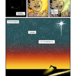
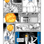
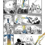
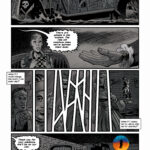
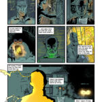
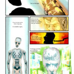
Support me and read the full colour comic over on my Patreon NOW Eisner and Harvey NOMINATED!

0 80933
 

Help!

About Emma Newman

Emma Newman writes short stories, novels and novellas in multiple speculative fiction genres. She is a professional audiobook narrator, and a Hugo Award winning podcaster. Her current podcasts are ‘Imagining Tomorrow’ and ‘Tea and Sanctuary’. www.enewman.co.uk

The Script

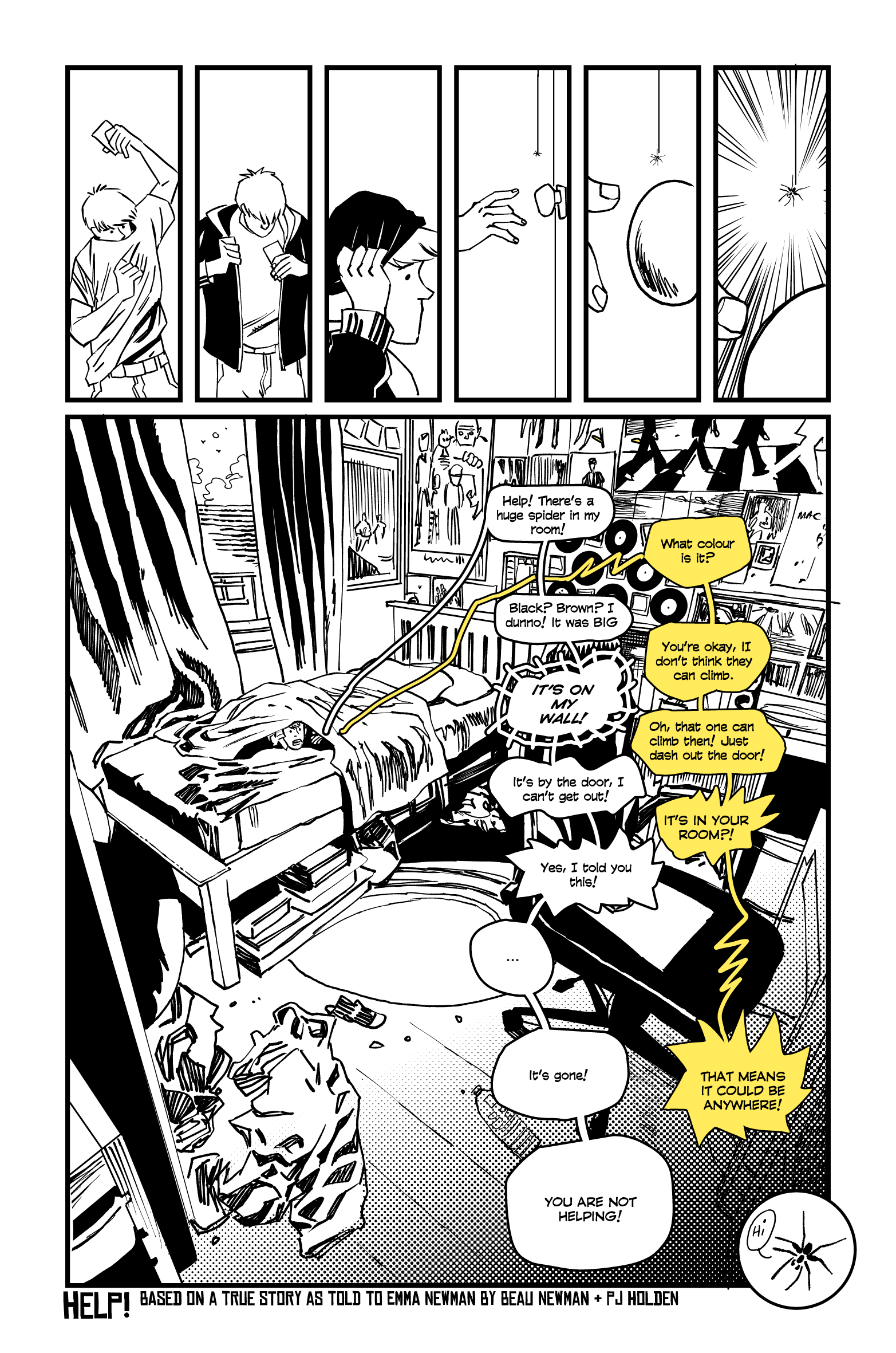
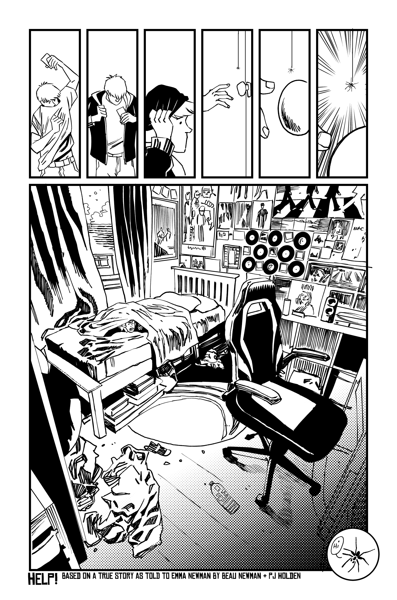
Comic script - this is exactly what happened to my son in the small hours of this morning. I only saw the messages when I woke up, and he told me what happened once he was awake. It made me laugh, and I immediately thought it might make a fun comic and Beanie agreed!

A young man (if you want to base him loosely on my son, he’s 16 years old, tall, short brown hair, blue eyes) is about to leave his room but spots a huge spider on wall next to the door (it is on the wall that the door would rest against when open and the dressing gown hanging on the back of the door would brush against where the spider is) . 

He is terrified of spiders, so he can’t open the door. It’s the small hours of the morning.

He leaps onto his bed on the other side of the room, a bookcase blocking the line of sight between him and the spider and tries to phone his Mum who is sleeping in her room across the landing, and message her on WhatsApp, but her phone is on ‘Do not disturb’ so there’s no answer. 

Panicking, he phones friends until one finally picks up - ‘Help! There’s a huge spider in my room!’

Friend: What colour is it?

Beanie: Black? Brown? I dunno! It was BIG

Friend: You’re okay, I don’t think they can climb.

Beanie: IT’S ON MY WALL! (throughout the rest of this exchange the friend also now freaking out is just making Bean panic even more!) 

Friend: Oh, that one can climb then! Just dash out the door!

Beanie: It’s by the door, I can’t get out!

Friend: IT’S IN YOUR ROOM?! 

Beanie: Yes, I told you this!

He peeps round the bookcase. The spider is gone!

Beanie: It’s gone!

Friend: THAT MEANS IT COULD BE ANYWHERE!

Beanie’s eyes flick to all the posters it could be hiding behind, and all the clothes and stuff on his floor it could now be lurking under.

Beanie: YOU ARE NOT HELPING!

He hangs up and hides in the duvet. If you think that a final shot on the spider’s hiding place would be a good ending, do add that in, but happy to end it on Beanie hiding.


Artists Notes

One of the goals of the project was to try and work with as many writers as possible, and so I told every writer "Don't worry - I'll take any format of script" - there are sort of comic script standards, and attempts have been made in the past to really hammer them in, but for the most part every writer I work with works a little different anyway. That said, this script required a lot of thinking about to get the most out of the story (you can argue amongst yourself whether that's what I did).

Firstly there's a sort of action limit in comics, every action will usually require one panel - character opens door, walks through door, locks door? that's three panels. I felt like, on this script, there was too much going on to fit in the super limited single page I had, plus some of the action I wanted to build it up a bit more, so I knew I'd be putting a bunch of panels towards the getting ready to go out (because build up build up build up build up PUNCHLINE!) I also knew I wanted the dialogue interaction to have that ratatatat rapid delivery, which meant I'd get a single panel for that set of dialogue. This meant brutalising the story a little, cutting out the contacting of his mum and going straight to the friend. I also wanted a little end note on the spider - I thought that would be fun, a happy little chappy. (remove the last spider panel and the page feels like it's not quite finished - it's a figurative and literal full stop)

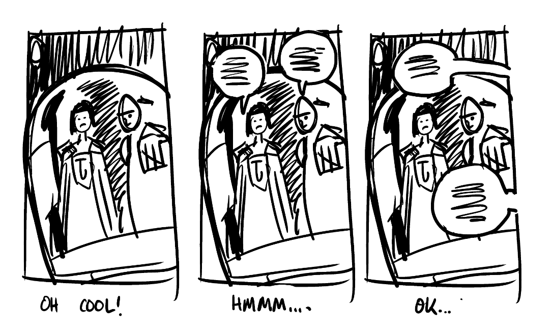
The manga shading effect/speedlines came after I'd drawn it and realise it would work better with a little bit of manga (tonally too, fits a teen), and the coloured lettering was because I needed someway to quickly distinguish the two sets of dialogue (I decided to eschew clip studio's balloon lettering tools a) because it would take ages to get exactly how I want it and b) because I thought I could add more character to it that way. The background of the room is pretty much a direct tracing of my teenage son's bedroom (which is so quintessentially teenager it looks like a set from a modern John Hughes teen comedy). (And it's all my son's work, he's done that all without parental help)

Anyway. This was finished the day before publication, but I think it turned out ok.

Oh, and because I drew it, and then slathered lettering all over it, here's the page without dialogue...

Bloody Helmet

Look, I’ve drawn the world’s angriest lawman professionally for coming up on 16 years (and a stint as an enthusiastic amateur for the best part of all my life up until then) and I still haven’t figured him out.

This Dredd head (Dredd is in a winter outfit, so it’s a little different to his normal gear) looks ok, probably – perspective on faces/heads is tricky since we’re not perfectly square shapes (well, my head is, but your’s probably isn’t).

If you haven’t spotted what’s desperatly wrong with this pic – it’s Dredd’s helmet (and the bit of neck that’s missing, but we’ll ignore that)

But drawing a very simple perspective cube over/ around the head though, we can get find points which should match up (without trying to plot the entire shape in perspective) and these points can then help us correct the shot – I’ve drawn a rough perspective cube in red, with guidelines, and put little blue arrows where I think the corrections need to go.

I pick points on the helmet that I think SHOULD line up and then fix the drawing to do so.
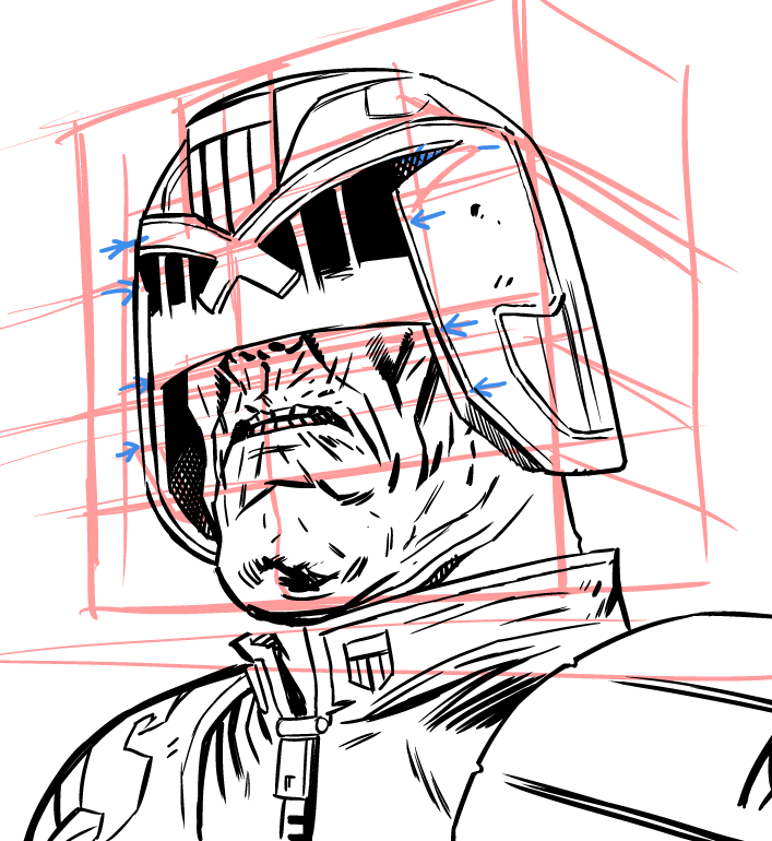
Looking at the blue arrows on the bottom (left and right) it should be very obvious that the bottom of Dredd’s helmet doesn’t match, in effect making the right side of his helmet look longer than the other side.

The blue arrows at the top (again on left and right) should match up where the eye slots are, but again, should be obvious here they just don’t.

(You can see this is a really rough perspective grid though, so I’m not overly fussed on 100% accuracy, just a rough “looks about right” which is far easier)

But editing the drawing and making these things match up, we get this…
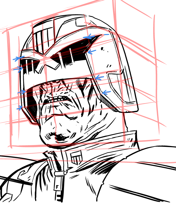
We’ve used those little blue arrows to help us place the features of the helmet so the line up in perspective.

Without the grid…
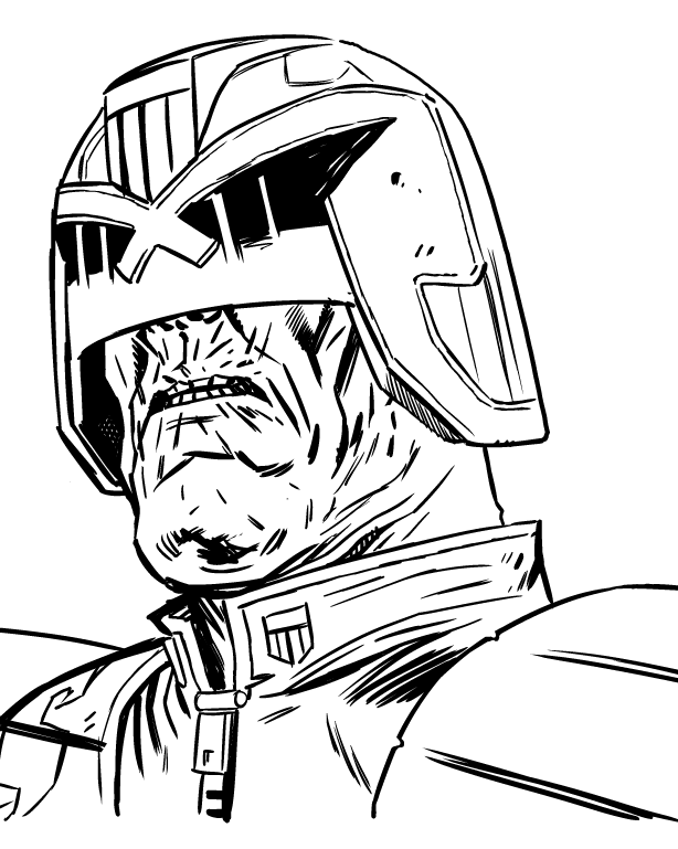
It’s a subtle thing, but I think this is a better dredd (oh, I added that bit of neck)

No… to erase this dredd forever since I didn’t draw him quite angry enough for the script… bugger.
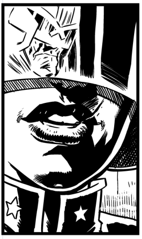
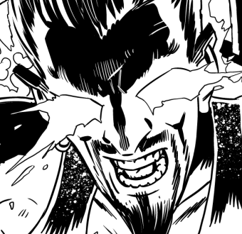
On the drawing board today…

Two pages completed today.

WIP on Dredd…(following the post on reflections, I got this in to a panel that I’m pleased with)

And did a second page today, can’t speak about it – it’s a pitch, so it’ll be long time before it’s firm enough to speak off, but you can see this…

Kids back at school, wife at work. Got plenty done. Still doesn’t seem like enough though.

(These pages are entirely digital)

WIP Dredd

Spoiler free, look at those idiotic tanks.

Pencilled and inked a page today, of which this is a part – hot off the digital tablet.

Even at two pages per day this month I may not catch up on everything I have to do.

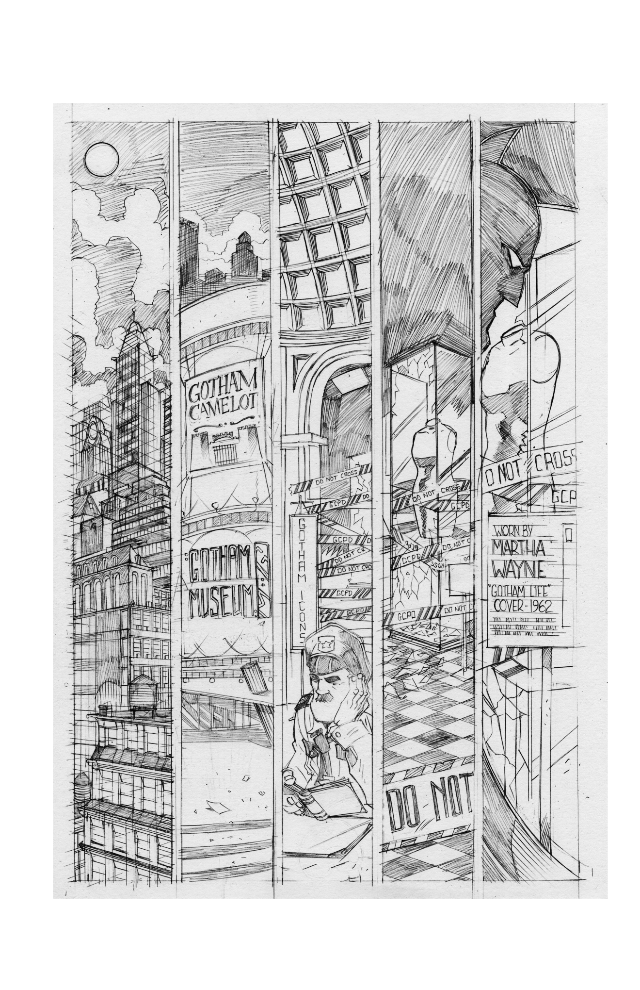
Ancient Batman Sample

So it was 25 years ago yesterday since the Batman animated adventures debuted.

I’m unsure of how old this (unsolicited) batman sample is, but it’s at least half that.

Even as I did these pencils I was aware they were far tighter than my usual. Now they just look insanely tight.

(five vertical panels? I bet I thought I was the bees knees, but it’s largely unreadable – also, why put batman’s ears on top of black, I should’ve made the bg at the top lighter. And … Bruce Timm much? actually no, not even a fraction of Bruce Timm, but look at that bored Commissionor Gordon/security guard.)

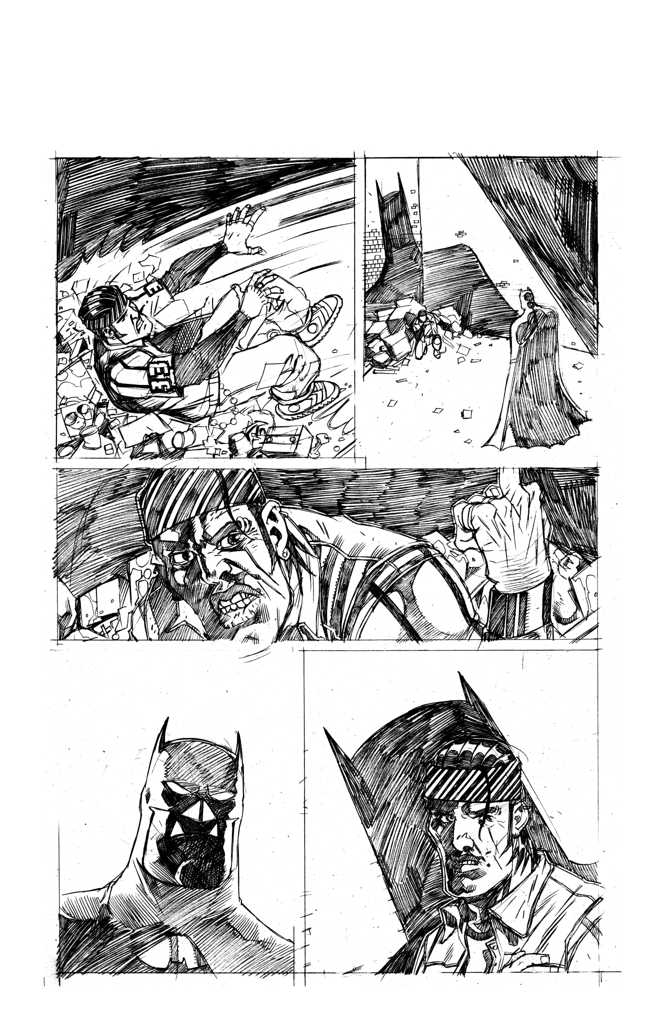
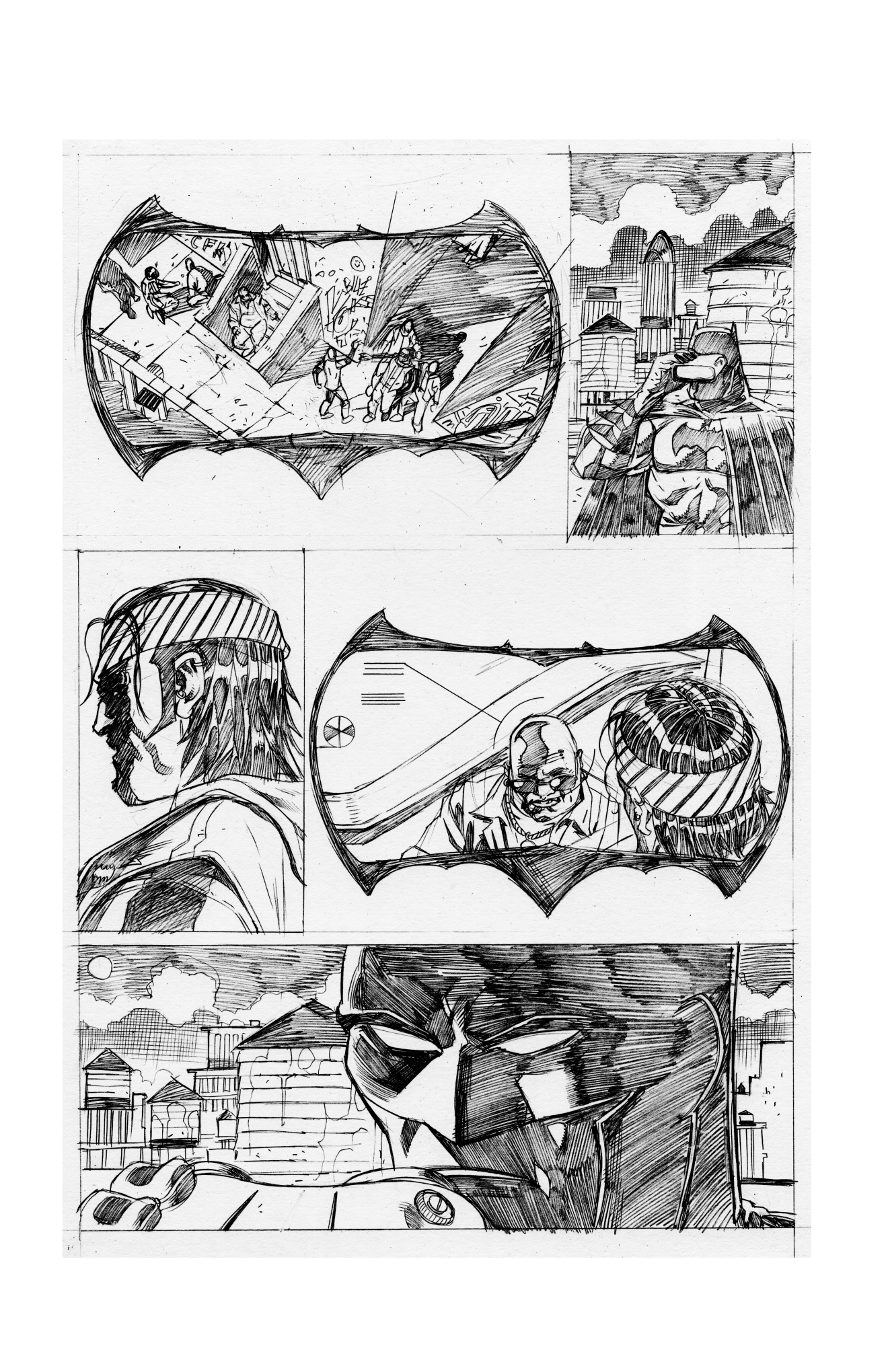
This page has nothing going for it. NOTHING.

I was pretty pleased with the Bat-goggles, and I still like the chunky batman on panel 2 though that big dildo-like building is fairly distracting.

(and I clearly used up all the perspective grid on that first page, cus here it’s all Aldus Huxley doors of perception perspective…)

Mini interview

I was asked in Feb to do a little interview for a student. Here’s that…

As a parent who is working professionally within the comics industry, do you encourage your kids to read comics, and why?

I think I’d always encourage my kids to read, regardless of what it is they’re reading. I like comics, and comics got me through a tough time as a reader, but my kids don’t seem to have picked up that deep love I had for them and treat comics as just another way to entertain themselves when they’ve been told they’ve got to come off youtube.

Given the current state of the industry, do you think young readers are catered to enough? Does the industry put enough emphasis on younger readers? Is there anything you think the industry could do,
from a publisher or retail level even, that would help open the door for kids into comics? Or is there anything that they are doing at 

the moment that you think is encouraging?

Price I think is the big issue. There’s plenty of kids comics on shelves in the newsagents and supermarkets (in fact more than at any time I remember) but they’re expensive especially compared to the hours of entertainment that can be had from video games, and it would be nice if all comics shops had a section that matched the Big Bang’s shelves for kid friendly fare.

What is your opinion on the all-ages books that are currently available? A common phrase used in comics retail, when suggesting comics for a new adult/teenage customer, is that there is a comic out
there for everyone, do you think this statement applies to younger readers or do you think more publishers should be focusing on the all-ages market?

I wish I could speak with some authority here, but I can’t. My experience is limited to my experience, and I have a tendency (like most parents) to try and impose my tastes on my kids, I want them to read 2000AD – I’d LOVE a younger age version of 2000AD – but they love pokemon and are pretty well served on that front.


What do you think kids could learn or what could benefit them from reading comics at a young age?

There’s an enormous amount of benefits to reading comics, I think – and many not so obvious. Expanding a child’s vocabulary seems pretty obvious but I think it broadens your thinking and helps you understand new more complex subjects sooner. Granted that’s often a little backfiring (I mean, it’s great my kids know what radioactive means, but it’s less great that they think it means it can grant them the powers of any animal that is radioactive as long as it bites them). It’s also amazing way to expand a child’s empathy, and can teach them social situations and how to react, again, comics being comics, there’s a hyperbolic nature to these things, but the little moments grounded in real life can help kids deal with knowing right from wrong, and knowing what side society they really want to belong to.

Story telling in reflection

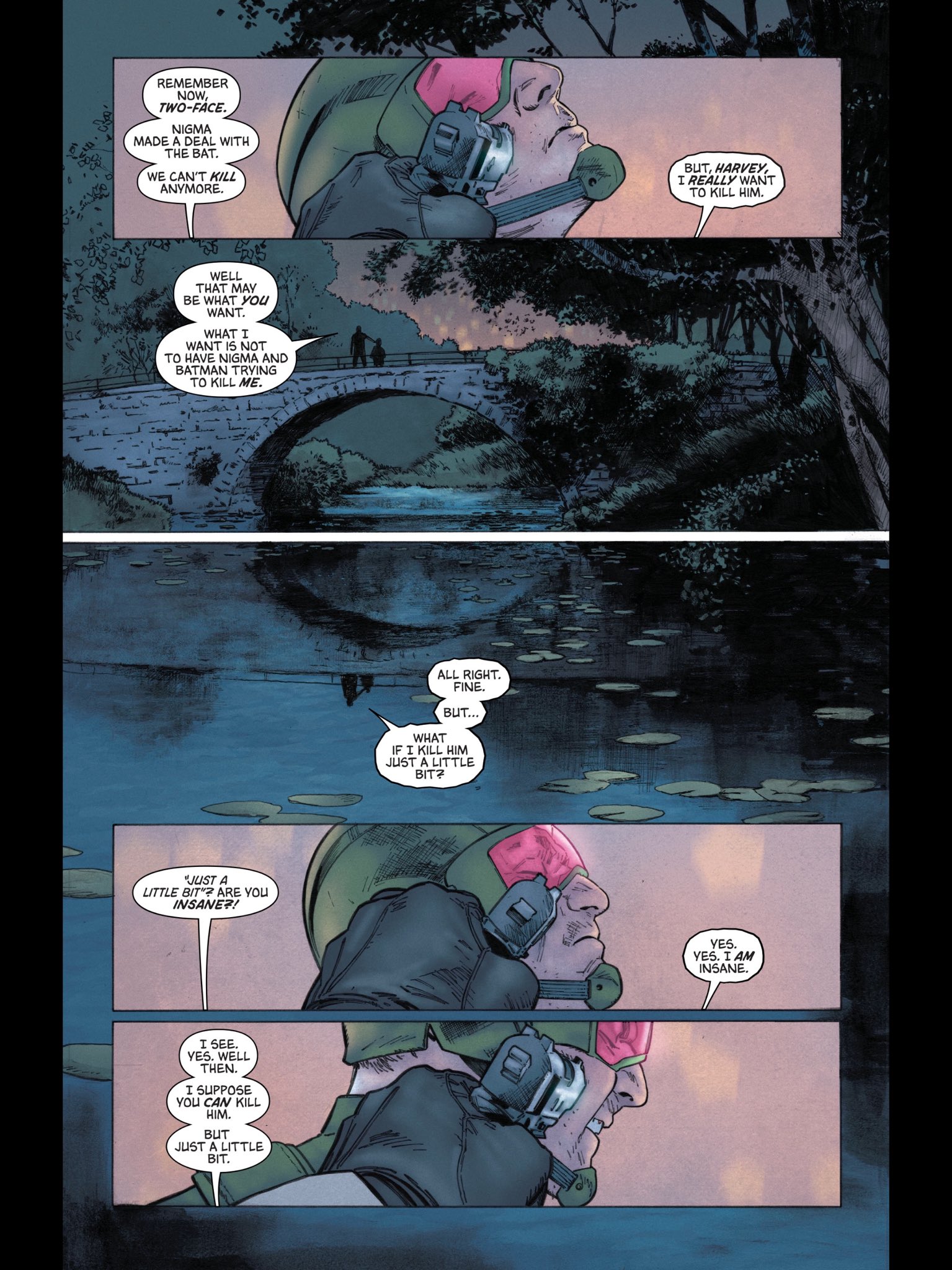
Tom King on twitter just posted this gorgeous page… The story telling is great here (though you’re coming in to the middle of the story so it’s not immediatly apparent that the the two voices are from one person – Two-Face

Art by CLAY MANN (not a batman villain) Seth T Mann (possibly related?) and Jordie Bellaire (the fresh princess)

Unscripted was the sequence where the bridge is reflected, it’s a beautiful composition, and it really works for both the story telling and the character. You can wait years to get a chance to pull off a cool looking story telling trick that is not just attractive but actually makes sense for the story.

No, the lettering (not sure who lettered it) is equally great, but it throws up one of the great conundrums of lettering… which is…

Speech doesn’t come from reflections.

It works here though, because, I suppose, Harvey’s evil side is a reflection and the illusion isn’t broken, partly because the speech is coming from a human reflected on a surface and there are no other humans in the panel. If you included, say, someone stood on the embankment watching it, the speech would suddenly seem weird – how’s it coming from there? (You’d think).

I only flagged it up because it’s interesting, and it’s interesting to see it done right (as here) as it is to see it done wrong – I drew a strip where, thinking I’d be super clever) I had two characters talking, with the characters drawn as reflections on the back of Dredd’s helmet.

I hadn’t taken in to account where the dialogue was coming from.

In this instance, the best location might have been if the dialogue had appeared coming from off panel with the characters reflections just being on the helmet.

As it was, the letterer had the dialogue coming off the reflections making it look a little like Dredd was talking to himself.

Can’t put my hands on the original art, so here’s a little simulation … 

(I’d note, if you have a specific intent in mind as an artist, probably best to let your editor and letterer in on it!)

Anyway, something to … REFLECT ON! hashtag dadjoke hashtag still got it.

Just say no…

The freelancers curse is never being able to say ‘No’.

No means you’re turning away work. (Who would do that?)

No means someone else will do the work and you’ll find out and you’ll hate them a bit for it. (and hate yourself in turn)

No means when the inevitable lull in work comes around and you’re sitting twiddling your thumbs and you remember that work you said no to you’ll think Ah jaysus. (And the money! THE MONEY!)

But yes.

Saying yes when you’re busy means you can’t give the time you need to do good work.

Saying yes when you’re exhausted means you can’t find it in you to do the best work.

Saying yes when you’re already overloaded means you’re more than likely to let at least one person down. Maybe two. Maybe three.

Sometimes the smart thing to do is to say no.

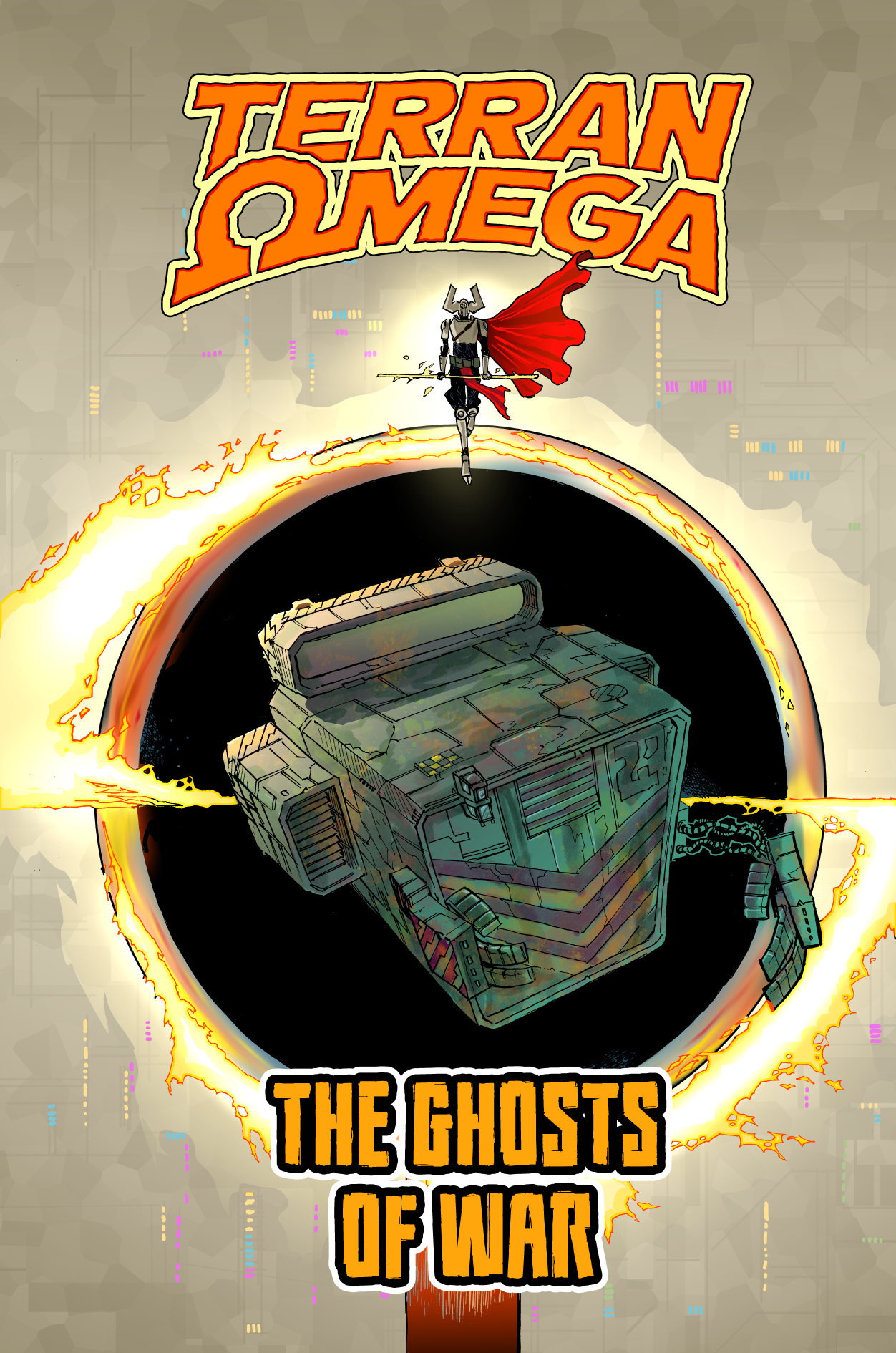
Terran Omega

Terran Omega came out of the idea of a last human, travelling the galaxy having adventures. A tale of Kung Fu in space.

This particular Terran Omega story was partly inspired by an idea of my pal Jim Lavery’s and Scott Ferguson helped out on dialogue/scripting. I’ve done a little bit of writing with Scott. It’s fun to work with someone else, given how much of a control freak I am.

Hope you like it, it appeared in the KickStarter for Broken Frontier’s sci fi anthology  but here it is for you, readers of the patreon!

(Later this week, I’ll talk about the writing process on this, cus I think it’s interesting…)

(I have ideas for other stories, but really, finding time is the biggest problem)

STORYTELLING!

Hey, so my Pal Steve Denton drew up a page of Dredd and I thought I could help him beef up the story telling. I thought this would be of interest. (Steve’s ok about me posting this btw, but he’s on face book if you’d like to say hello)

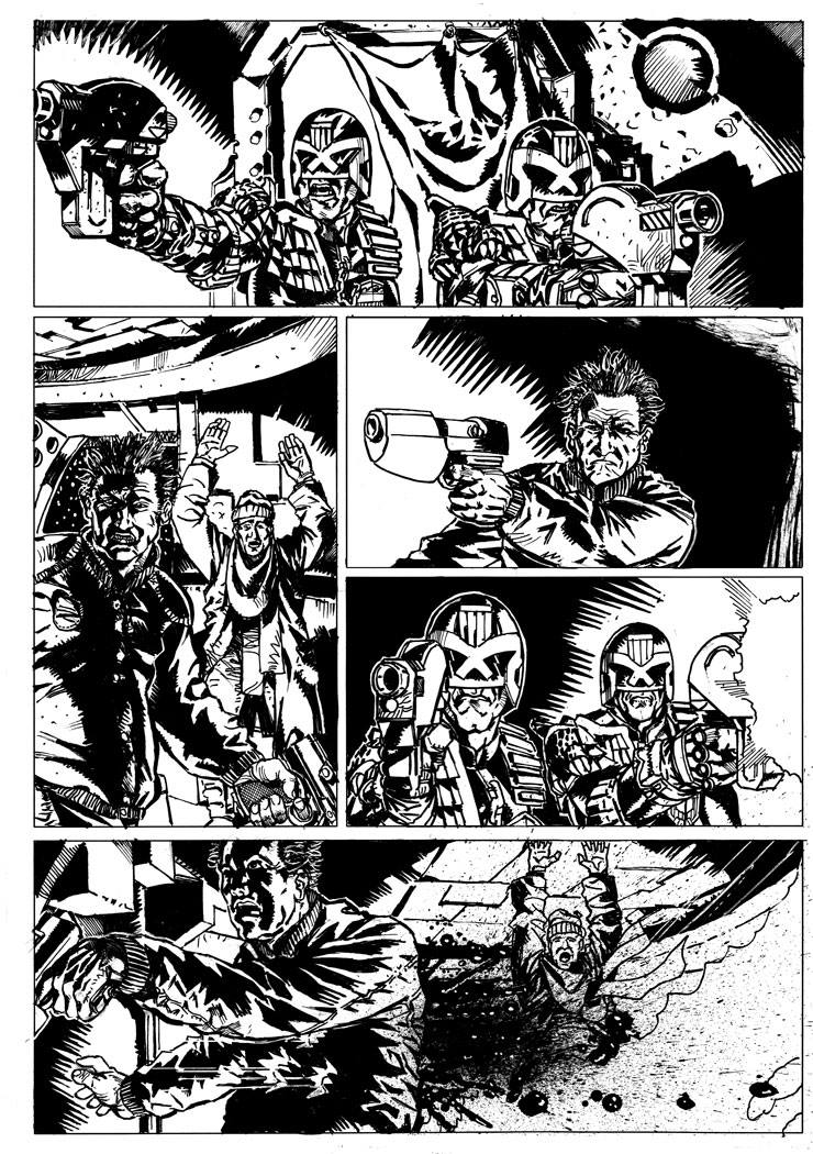
Here’s Steve’s original page:

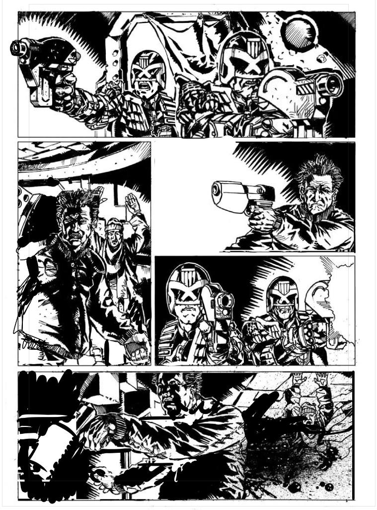
So, on these redraws I have a couple of rules for myself: largely I don’t redraw any of the art. I try and use as much of the art as it exists – it’s not about quality of the linework it’s about how to strengthen the storytelling. I can accomplish that by selecting and resizing, and flipping and moving artwork around. Sometimes that leaves holes in the page and so I’ll scribble a bit of a redraw over that. But I’m always wary of the idea that many redraws are someone going “You should draw more like me”.

So, that said, here’s the redraw

Ok, I don’t have a script for this, so I might make incorrect assumptions about what’s going on a who characters are, but here’s the notes I gave to Steve (with some extra annotations as they occur to me in square brackets)

 Steve, I hope you don’t mind, I took the liberty of tweaking your page a little bit, I think there’s a few places you could pump up the story telling and help push the depth a little better.

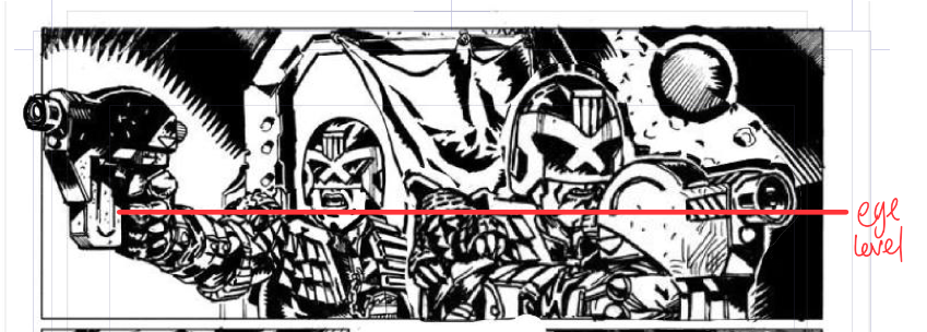
panel one – making Dredd larger than the other judge (is the other one rico? I’ve assumed he is and dea-ged him so he looks similar but younger.)[making dredd larger is basically bringing him closer to us the reader, this adds to the sense of depth going on, especially with a bit of overlap, and making sure they’re still hanging off the same horizontal line – the eyeline on this panel is roughly where dredd/rico’s chins are. So if I increased dredd to a rediculous size, as long as I lined the chins up it would still be a convincing perspective…]

Panel two, pushed the guy over a little in the panel, so you still get the distance, but the overlap pushes the 3d that little bit more. [Also, as a friend of all letterers, I try and push all characters to the right of frame where possible…]

Panel 3, I’ve moved him further over in the panel so he’s less centre of frame (in TV this is referred to as a “Noddy” shot, when you have two people face each other you want to leave plenty of deadspace in the opposite sides – since you lack – at least in this page – a decent shot of judges and bad guy in one panel, you’d need to reinforce the fact they’re in the same room. I also blew out the left hand side of the panel. That’s really just my taste though 🙂

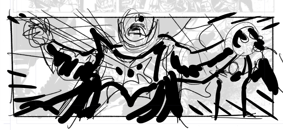
Fourth panel,[in tv land, this would be the reverse noddy, so you want dead space on the right here] I’ve flipped Rico(?) because you have them pointing guns in two different directions at the same guy (at least based on this one page, maybe a second page will show other bad guys, in which case my bad, but as is it looks a little confused, tweaking the direction of the gun here helps focus on the fact they’re in the same room)

and, finally, Panel 5, moved the guys over to the left again (same reason as the third panel) and moved the gun shots, since Dredd is aiming/shooting at shoulder height, makes no sense for the bullets to impact at waist height.

—–

Now, I’d add, ignoring my own rules for a second, I’d be looking at ways to vary the angles a little bit – especially that last panel which feels like it needs a worm’s eye view (a shot from below looking up), or dutch angle (a tilted angle) to add a bit more impact, it’s a little TV budget shooting right now. Something a bit more like this (for example)