Monday Dog tag layouts. DT pencils 1-3. Colours TO pg5 Tuesday DT pencils 4-7 Wednesday DT pencils 8-10 Thursday DT pencils 11-14 Friday DT pencils 15-18 Saturday TO Pencils 10-11 (double page spread) Inks 10-11 Sunday Catch up on anything I missed.
So: 20 pages of pencils (hahah probably not)
So what actually happened, well, I wrote off about two days due to er… new computer. Bought myself the Macbook Neo, so I could spend some time focusing on writing. No regrets (well, one, I wrestle with the fact I bought the £599 model and didn’t spend the extra £100 to get the £699 – which has a fingerprint sensor and double the storage – every day I think “well, it’s only a hundred quid” – but no, sod it, I bought the cheapest laptop because I wasn’t even sure I could properly justify it.
In the end, I pencilled 12 pages – DT pages 1-12. Some days I got three done, some days I got none done. I think I could have got close to 20 if I’d been more disciplined.
This week:
Monday – DT Pencils 13-14. TO Colours Page 6 Tuesday – DT pencils 15-16 (2 pages, got lunch meeting) Wednesday DT pencils 17-19 Thursday DT pencils 20-22 Friday Catch up and scan on the DT Pencils Saturday TO Pencils 10-11 (double page spread) Inks 10-11 (brought over from last week) Sunday Catch up on anything I missed.
That plan calls for 14 pages of pencils, one page of colour and 2 pages of inks. Doable. More doable than last week.
Here’s how I justify three pages of pencils a day:
10-12 Pencil most of a page. 12:30-2 Finish it. 2-5 Pencil second page. 7-11 pencil third.
These are lose pencils, sometimes with notional backgrounds. But I’ll work those out later.
I will also be spending this week refining the second Terran Omega story. I’ve written it, I just need to print out and spend a day or so just going over it with a red pen.
Saw some sunshine last week, and I’m excited for summer to start and I get outside and sit in the garden and do some work. I’ve detached myself from digital drawing enough that actually I can bring a drawing table down to the garden and do pencilling (and maybe inking)
I’m going through my notes on my computer, just culling and tidying and stumbling across ideas.
I wrote this out for a workshop some time ago, 2017 to be precise. At that point I’d written ZERO futureshocks (later on I’d write on terror tale)
Anyway. You can take or leave these.
Comic creation workshop. 20 solid ideas for creating future shocks
Create lots of ideas.
Edit/merge/invert those ideas.
Tease out the story from the idea, does this lead logically to that?
Write, then find your theme.
Rewrite knowing what your theme is.
Twist once is good. Twist twice is clever. Wrong foot the audience when you know that’s what you want to happen
Avoid VR prison stories. avoid killing hitler. Avoid they were Adam and Eve.
If you can’t avoid them, subvert them. Invert them. Add to them. Mix them up.
No story idea is ever dead, just sent to the great recycling notebook in the pocket
The finished story should either confirm your theme or repudiate your theme. Is the story that greed is good? Does the end confirm that or flip it on its head?
When I first broke into comics, 25 years ago kids! (16th March 2001 is my first 2000ad credit!) I somehow convinced myself that only by using a brush – a proper tool proper artists use – could I somehow be worthy of being a pro. Up until this point I’d been drawing with a Pilot V5 Tech point (a pen I still love).
John McCrea had suggested I get some obscenely long rigging brush, which he found easy to control but I found impossible. But It did lead me to my beloved (at the time) Sapphire Series 51 10/0 rigging brush.
A rigging brush is designed to help you paint the delicate line work of rigging, so tends to be longer than a normal brush and thinner. The 10/0 was akin to about 10 eye lashes strapped together.
A fine brush that took me quite a few years to get the hang on. Certainly those early lines were over worked, fussy and just too heavy in general. Combination of my inexperience as an artist and my inexperience with a brush.
But, as I got better with it, I started using it more like a pen. I still think the most natural and attractive line is one that comes from a brush. But these days I find a brush too difficult to handle. Partly my eyesight not being what it was and partly er… the handle – it’s very very thing. And arthritis make holding it a bit of a chore. I mean there are ways around it, I’m not adverse to wrapping most of the business end in a big ball of masking tape, but you never quite get it right.
Eventually I went to thicker brushes, but I could never get a good enough line, and the rolls royace of inking brushes Winsor & Newton SERIES 7 Kolinsky Sable Artists Brushes start around £20 for the #1s, and there was no way on earth I was ever gonna spend £20 on a brush when I knew how badly I treat brushes (SO BADLY – I’m sorry to all my brushes who I never managed to look after and who often spent more time being crunched underfoot rather than bathing in water to be cleaned)
SO I shifted gears to, sometimes brush pens, sometimes pen nibs (G is my current favourite) and sometimes digital. Right now, I’m on dip pens.
But brush remains the gold standard.
On a somewhat related note Șøštěr’ş Ġřęëñ (I refuse to lookup the spelling) are selling synthetic brushes for insanely cheap prices – 66p! Look they’re probably rubbish, but honestly, they might be good enough for filling in large black areas, and that’s what they’ll mostly be used for.
On Writing
I’ve posted this on bluesky already but I’m keeping it here because… well… it’s the 21st Century and nobody trusts social media any more….
Whats keeping me writing is the idea that ok, I’m not ever gonna be Alan Moore or Garth Ennis or (pick your favourite) but also they will never ever write exactly the thing I’m currently interested in and maybe it’s only me interested in it, but I’m also the only one writing it.
The more I explore writing, the more I stumble in to things that are interesting to me and the more I think we’ll I sure wish someone smarter than me was writing this, but then those people are finding their own thing to write about, so if it’s interesting to you, maybe it’ll be interesting to others. Maybe don’t worry about not being good enough to tell it. Tell it first, then worry afterwards, because honestly, it’s not like someone else is gonna tell the exact same story as you.
In contrast, I added this:
This is slightly different to what keeps me drawing. I love other artists work and I see it and think “Hell yeah, I want to do that” and then fail, but I enjoy the bit between “Hell yeah” and “oh that’s not turned out how I hoped”… so I keep doing it.
It’s funny to me, when I hear people say such-and-such an artist is so good it makes me want to quite, and I don’t know if it’s because I’m an idiot, but seeing someone better than me (and there’re quite a few) just makes me want to be better and do what they’re doing. (Unless they’re 30 years younger than me, but I get round that problem by just assuming they’re gifted geniuses, whereas I actually have to work at being any way half decent, so the fact I am is testament to the amount of work I put in. Oh you think I’m rubbish, we’ll you should see how bad I was before I practised my ass off.
There’s one of the terran omega stories I’m writing that I was thinking about last night, it would be issue 8 in a 12 issue arc. (I’m pretending that this is all happening, but it’s the only way I’ll get better as a writer is to er… write).
Anyway in this little short, it’s about … journey versus destination, and I was trying to unlock it in my head, I knew what was happening, and I knew what I wanted it to be about, and I thought oh I need a pov character. So I added one. And then….well I don’t want to spoil it, but it unlocked what it was about and why. Up until then my why was a more “just because this is the kind of thing I fancy drawing” and now it’s “oh IT’S ABOUT THIS THING”.
I find that happens a lot when I write, I have some very solid visual idea or something that will be cool in my head, and then mulling it over, telling mysdelf the story again and again, sometimes I’ll unlock the themes of it and discover it needs to just really pull together with that theme.
Is there anything more dull than talking about writing? Explaining jokes, or telling someone else your dreams maybe.
At least with drawing there’s some pretty pictures, but all you’ll get out of this is “And then I wrote a new draft”. Which is not thrilling. Anyway, please forgive my indulgence, but this is what you’re gonna get.
In other writing news
Sometime ago I wrote a terror tale for a 2000ad pitch sent it in, Matt liked it but wanted one (minor) change to the end, which … I never found time to do. So I’m going to make time next weekend (I’d better remember)
I also, was sat in the car with Pye Parr and talking about him writing his own stuff, came up with a fun short pitch, which was the first time I thought of a story with a eye on someone else drawing it. I recently reread the script I wrote up, and actually, I think it’s enormous fun. So, I think the following week I’ll dust it off and send as a pitch to 2000ad. Pye probably won’t have time to draw it, but I know another artists for whom this is perfectly in their wheel house.
I really am trying to make the time to write things, it’s hard because often you know these things will go nowhere (unless I draw them myself) and so you could write yourself hundreds of stories and they’ll just sit collecting dust.
But this year, at least, if I spend this year trying to focus spare attention on writing, I might make some progress in my abilities on that front, and maybe find a home for some of these things. We’ll see.
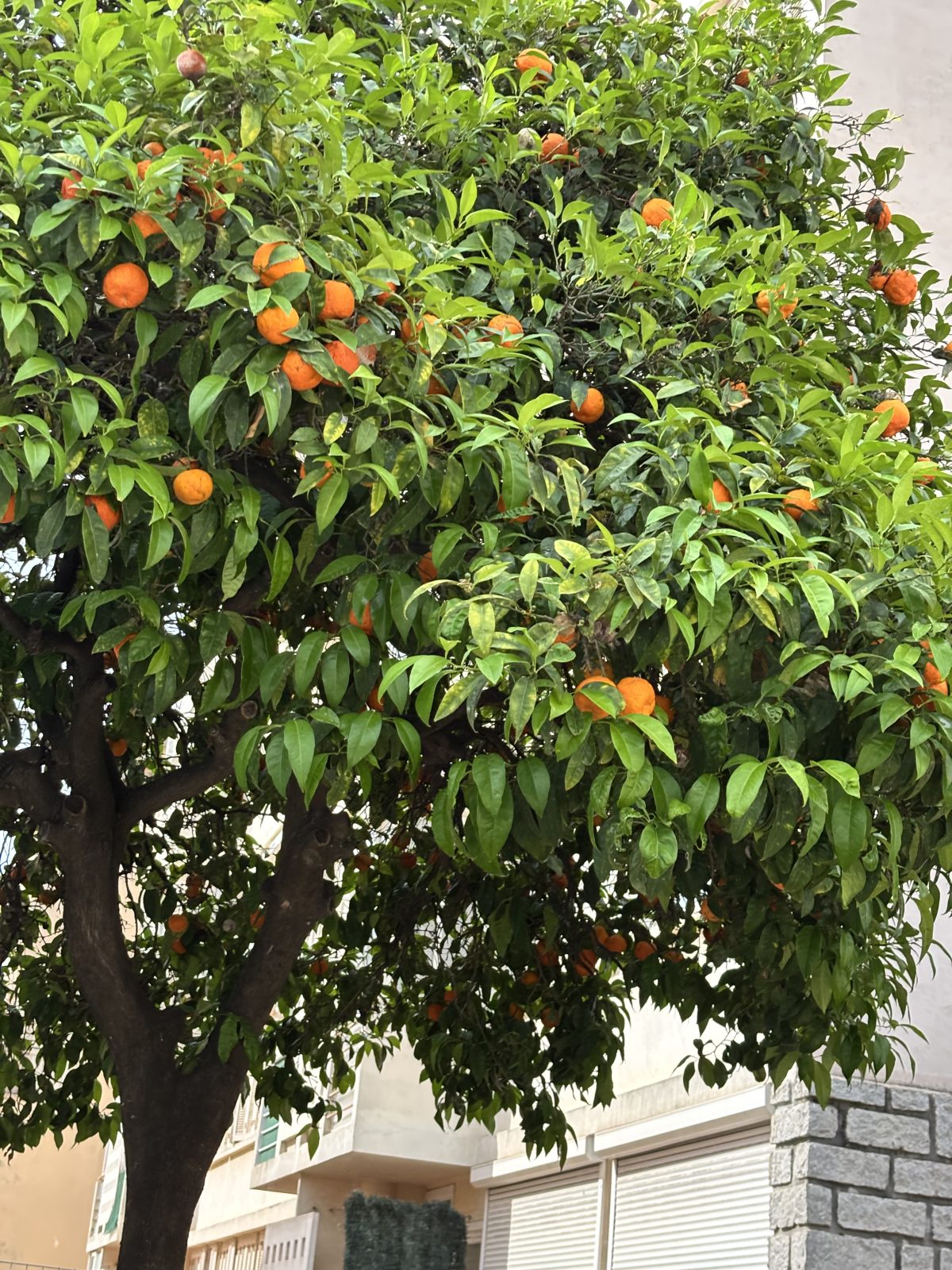
I’m not entirely sure when I first discovered naval oranges. I know I didn’t really think of them much as a kid, but somewhere in adult life I stumbled across them and realised these – at least in Belfast – tended to be a winter treat. They’re big, fat and if you’re lucky, juicy oranges. I suspect the ones we get are nowhere near the treat they are in Spain or other countries where they can fall ripe from the tree instead of requiring shipping.
I spent a happy day googling them once when Iwas trying to figure out exactly what they were (because even now they’re often just labelled “Big Oranges” in most shops here, presumably so when the season ends they can be replaced by another kind of Big Orange that has pips).
Did you know they all come from a mutant fruit, because they’re seedless every tree has to come from a cutting from that original tree.
And, as a mark of how different humans can be, someone posted on bluesky “What’s the most over rated fruit” to which someone else responded “The Naval Orange”
Have you tried Miracle berries? A few years ago (oh god, that’s probably actually a decade or more now) I did. A weird little African berry that when chewed and mushed around your mouth it has a peculiar effect of masking your sour taste buds, making every thing you eat for the next 30 or so minutes that much sweeter. A sort of bitter-cancelling berry.
I should really try a miracle berry with a naval orange.
(I know you’re asking, has Paul finally run out of things to blog about on a daily basis… maybe?)
Writing
Yesterday I set a single pomodoro timer to write up a script for what would be a theoretical issue #3 of Terran Omega. A skeleton draft. And 30 minutes did it.
My drafting process is to start with page 1, include dialogue or other bits (enough that later I know what the page is doing and so I can go back and figure out panels) and then move on to the next page – but from page 2 onwards I write in two page chunks. Pages 2-3, Pages 4-5, Pages 6-7. This helps me remember that the page turn will happen on odd pages, and it makes the process that little bit easier.
Later I can go in and chop those pages up, if I want to, but also if they’re a double page spread then that’s fine.
I wrote 20 pages that way in 30 minutes. Though to be fair I’d been mulling those things over for a bit of time before I started. The thing is now I have a first draft. It’s a matter of editing. And I might do that today.
I think I’ll be aiming for 20 pages – ending a strip on even page numbers is good, because you can get a nice dramatic page turn on the last page.
With #SmallProphets on everyone's minds, you might be interested in some extra info on Homunculi. Back in 2017 I wrote this piece: "How to Make a Homunculus" for the Daily Grail [link]
When I was 27, and before I had anything but a couple of small press credits I went to my pal Mal Coney (a Belfast comics stalwart and at one time the writer on a bunch of image books, like The Darkness) and ask did he have a complete 24 page script I could draw because I was convinced that I needed to be able to draw a monthly book (again this is BEFORE I had any sort of career) I just needed to know I was capable of doing it.
He gave me a very silly strip called The Simply Incredible Hunk, which was a camp carry-on movie version of the Incredible Hulk.
I drew it in 25 days. While working a full time job.
And from that I deduced, that, yes, I could draw a monthly book.
Now, I’ve never really been tested on that front, but the lesson stayed with me. You need to know if you’re capable of the job you’re looking to do (no point me looking for deep sea diving work when I’m deathly afraid of drowning)
So this year I’m trying to focus on writing. But the truth is the Terran Omega script that I’m currently drawing was written around august, so I actually haven’t written much since then. Well, that’s going to change. I’m about to embark on a somewhat mad exercise of writing Terran Omega as if it’s an ongoing comic. That means at least one script per month.
I mean at the pace I’m drawing it, that will mean I’ve got scripts to draw for the next twelve years too.
The thing is there’s a couple of problems with this idea, number one I just really don’t know how to write that much work. Even the Terran Omega I’ve written has so many draft documents it’s a messy file system. So I’m sticking a simple file system on my computer Terran Omega -> Issue 1/Issue 2/Issue 3/etc.
I sat and worked out the rough contents of twelve issues (actually ten, if you count the two I’ve already done) and now I’m going to slowly go through them and see if I can write ten comics. Some of the stories are two issues (as is the first one “The Ghosts of War”) then a three issue (because I need to be bolder) a one issue thing and finally a four issue thing. Just to build the writing muscle.
Here’s the (working titles)
#3 – The Seed part 1 #4 – The Seed part 2 #5 – The Seven part 1 #6 – The Seven part 2 #7 – The Seven part 3 #8 – The Journey #9 – [untitled] part 1 #10 – [untitled] part 2 #11 – [untitled] part 3 #12 – [untitled] part 4
The Seed I’ve been writing in my head for a bit. My process is write down some cool visuals or twists or something interesting, then try and figure out how to tie them together and then hammer in on the themes and what it’s about, and strengthen that in a rewrite/edit process.
Usually, I’ll try and visualise the entire story on a long drive to my Mother-in-Laws, it takes about an hour and by that time I’ve often got some really good milestones for the story locked down.
Because I’ve never tried anything this ambitious in writing before my brain has hopped about all over the place on the stories, so I’ve bits and pieces of all twelve, but nothing solid.
The Seed was a follow up I thought about doing even before I’d started the Ghosts of War, but as conceived it was an 11 page short and I thought, but maybe I want to do another 48 page novella, what then? So I mulled it over and realised this story was a great way to get in to a little bit of Terran Omega’s past and by doing that I could turn a short into a two parter. A thing I think I learned from the musical episode of Buffy, where it should be a throwaway silly episode that you can enjoy because MUSIC! But turns out it has some of the biggest reveals in the series (notably the moment the gang all find out where Buffy had been when she was dead [spoilers for a episode that’s what 25 years old?])
The Seven was also vying for a second place story, but it’s a bigger story and more ambitious and I felt I needed to get some more pages under my belt before attempting it.
The Journey was just a very quick idea that I thought, yes. A reward for me, in some ways. An important character piece, which would be a bad one to start with but actually sitting in between longer stories it feels right.
The last one – [untitled] – is actually titled, but the title feels spoiler ish, and so I’m keeping it to myself in the mean time. I have a start for it, and a reason for it, and the world that it’s in, and I kind of know the sorts of things I want to explore and actually I’m keen to get to it. We’ll see.
Today On Social Media
Speaking of writing, if you want to go away and read this you can do, but it is tiem well spent – a blog post that basically tells a great little creepy short story but in a form of a blog entry that’s an exploration of the changing english language the story is really just a hook to hang that exploration on, but I love it. I love it all. I love the story. I love that you’re told what’s going on and I love that it explains all of the language changes.
How far back in time can you understand English?

An experiment in language change

Link here.
Make a business card(last time I did this was 15 years ago and honestly, I overprinted by a few hundred and gave away … like six… comics as an industry doesn’t bother itself too much with business cards) Print Business card (online service of some sort) Finish page 24(colours) and 25 (inks and colours) of Terran Omega. Edit Terran Omega issue 1 for typos Send it to Mixam for print. (why mixam? I’ve used it before and know how it works and time is a big factor)
Right now largely going through the final version of Terran Omega and correcting/editing. Thanks to Scott Ferguson and Ron Abernathy for editorial notes.
Should get this to mixam this afternoon.
I went with Vistaprint for business cards which somehow will arrive after my comic will. Weird eh.
250 cards. I’ll need 20. But they shouldn’t change much in next 20 years so maybe I’ll keep using them for ever.
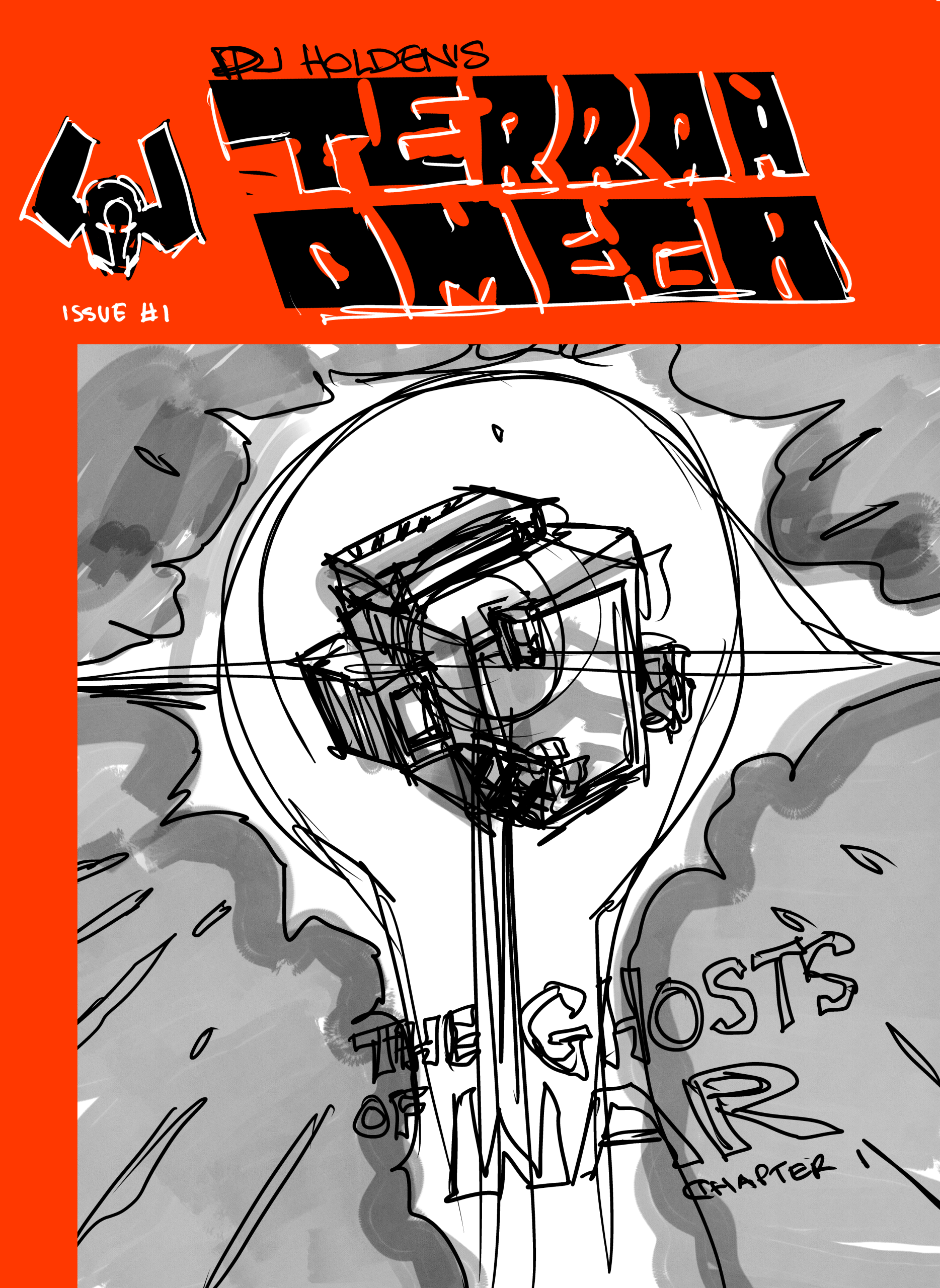
Here’s the introduction text for this issue of Terran Omega
Terran Omega is the last human in the galaxy.
Given godlike powers to fight in mankind’s battle against an alien universe, she was placed in suspended animation to be woken when humanity needed her most.
The call never came.
Ten millennia later, mankind has vanished.
She is alone.
Faced with the existential crises of being a weapon built for a long forgotten war, she makes a different choice:
She chooses life.
Now she travels the galaxy trying to right mankind’s wrongs, collecting the destructive remnants humanity’s final war. A war that, like her, has passed from history into myth.
At the edge of the galaxy, she is about to encounter one such relic.
A weapon abandoned for ten thousand years, left to fester, grow stranger, and become far more powerful than ever intended.
Now I’ve gotta go, still got a lot of editing/exporting to do!
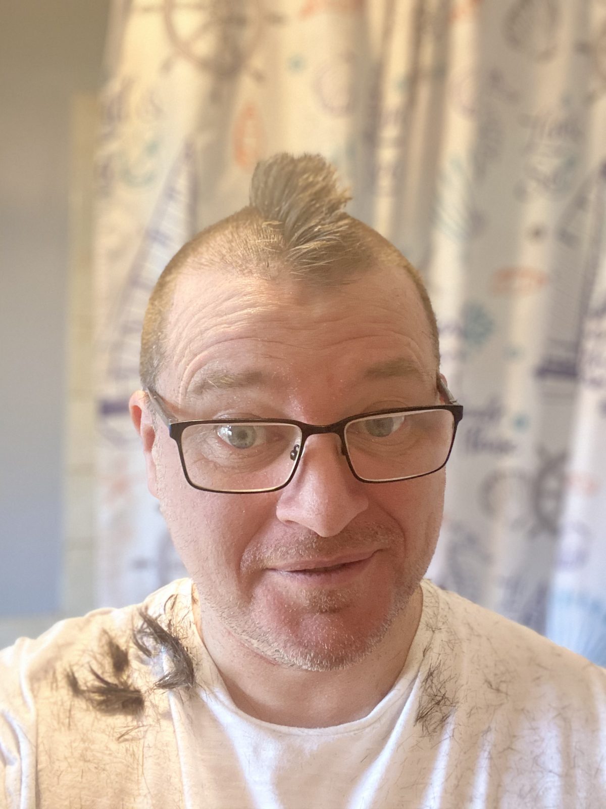
I have a note with a suggestion for today’s blog, it simply says “haircut”. Why it says that, I’ve no idea. I know that I got a haircut yesterday and I know I had something I’d intended to say about it – what that was I don’t know?
I’ve already talked about haircuts before, I even wrote a comic strip, but do I have anything new to say on the topic? Probably not. I’ve been getting a haircut once per month every year since I was 14. With the exception of the covid lockdowns – which means I’ve spent in the region of £5k in that time on hair.
I complain endlessly about my hair, it’s a thick matt of animal rug, slightly receded at the front, but not so you’d notice. There’s a little bit of grey, again not a lot, and what is there is usually less visible when I’ve recently had a hair cut. It comes to a widow’s peak. When I was younger, I’d get a flat top hair cut and two odd little side tufts would look like the little bits of an owl that look like ears. Twit twoo.
Unsolicited writing advice, no. 21456: There are two kinds of writer: the ones who write for love, and the ones who do it to get results. In a world in which writers are paid less and less, results are often uncertain. But if you really love what you do, you'll keep going.
I mean, the horrible reality is doing it for what you love is also going to pay less. But at least you’ll starve doing the thing you love.
Yesterday was trailertastic day on youtube
Here’s the New He-Man and the Masters of the Universe Trailer.
Honestly, I missed He-Man, it came out just as I’d aged out of playing with toys (I mean I was 11, what did I think I was gonna do?) I think I’d gotten in to comics and He-Man just seemed a bit silly. Even his name, for gawd’s sake.
My youngest brother at the time (another brother would come along much much later) was well in to it though. I think when I was his age we were quite a poor family, but in the meantime my dad was doing much better and now he had everything – He Man, Castlegreyskull and I’m sure all of the figures. He’d also gotten every single star wars thing you could get, death star, millenium falcon, everything.
Though to be fair I’d never felt like I didn’t get the kind of toys I wanted as a kid – largely anything Action Man related.
Anyway, longtime friend Ross pointed me towards a trailer for another movie, Death Stalker.
Every bit as silly, and much lower budget and yet this looks more fun.
My mate Rob has a new creator owned comic out from Dark Horse, I’ve read the first issue, it’s enormous fun (and gorgeous)
It’s up to a van full of washed-up retirees to save a baby kaiju before its powers are used to destroy the world in @robwilliams71.bsky.social and @nilvendrell.bsky.social new comic series Hidden Springs, kicking off on May 13! @comicbook.com shared the details: https://bit.ly/4pRr5V0
I dunno if it’s obvious but I’m trying to ignore the state of the world, and the news in the blog. There’s enough of that out there. This is a place for imagination and happiness and joy, and oh sod it, ok, one little thing (and I’ll explain why in a second)
Musk, at Davos:
“My prediction is there’ll be more robots than people… everyone on Earth is going to have one and going to want one… who wouldn’t want a robot to… watch over your kids, take care of your pets… we are in the most interesting time in history.”
Isn't this a telling aspiration? To want robots to look after your kids, so you can do stuff, rather than robots to do stuff, so you can spend time with your kids? The darkness inside these shrivelled men must be like a gaping unfillable void.
To me, this is the bleakest possible 2000ad Futureshock, a clever four pager by Alan Moore with dark broody artwork by Jesus Redondo – a kind of inversion of the One Christmas in Eternity (where humanity has invented immortality, and so never die, but conseuqentially, no one is ever born and there are no children, except the little artifical boy you get to have at christmas to open presents with)
So, this lead me to thinking that actually the future shock format is a wonderful short story format that I don’t think enough people play with. It can be quite formulaic, but once you crack it you can pretty much write it indefinitely – Alan Moore certainly did. If you want to write (and I say to this to myself) you could do worse than scour the news (and focus magazine, and new scientist, and any journals you spot – all available in the libby app or your local library) for a a couple of articles that you can tweak in to a future shock style story. Biting irony, twist in the tale. Doesn’t have to be good, just do it for a while and see where it leaves you.
Ther rhythm of a four page future shock to me is setup, escalate, ironic twist. There’s not room to do much more than that.
Set up :
A world where robots can do every job.
Escalate:
But there’s one job they can’t do, we see the world the robots have made.
We see children running around and robots doing everything to help them they love the kids. No adults anywhere.
Escalate: We see the adults, they are in lock step, walking towards some giant factory. Wearing Robes. Maybe a younger male is talking to an older man “First time, huh. Just turned 18? It’s not so bad. They feed you”
Escalate/twist: the robots talk, they love children, it is entirely the purpose of their existence to look after them, they love them.
Which is why it’s so important that they maintain a good breeding stock of humans to keep the children coming.
That’s it. (Is it good? maybe, certainly you’d want to polish it more and more, and maybe throw in some wilder twist? maybe an adult escaping from the breeding farms and seeing life, which he remembers.= – maybe the children on reaching adolescence get their minds wiped, and one man remembers it as a dream?)
I’m starting to mull over my kickstart options and so I phoned Matt Garvey, since there’s few people know more about publishing comics on Kickstarter than matt (who, coincidentally, has a new kickstarter about to launch – The Skim, a casino heist comic with some amazing artwork – great big juicy double page spreads that you’ll want to see in print)
So here’s the shape of it, it’s nebulous and foggy and I’m doing some thinking on the page as I type it, but the more I concentrate the more I can see it forming up…
I’m going to do a kickstarter for Terran Omega The Ghosts of War. Single issue comics for part one and part two.
Issue One, right now, I’m looking at March launch date. Soon, right! TERRIFYINGLY SOON! (so it might move)
Launch issue 1 on kickstarter, with some tiers:
PDF File / colour & B&W&Green
B&W Copy (why no green, you ask? Price, I reply!)
Full Colour
Full Colour with Alt Cover
Pages 1-25 with front and back cover, should come to 32 pages in total.
There will also be add ons to get PDFs of the Artist Edition – same comic with big super high res versions of the images!
I think the comic price will be about £8? (pricer than I’d like, but I am really figuring things out here and don’t want to go too low and burn my fingers) and I’m two minds about doing an alt cover. I suspect some people might want both copies and there’s a part of me hates that for them (maybe I can work out a two edition price?)
I anticipate there being 100 printed and sales hitting 50 or so. Maybe.
Haven’t looked in to postage yet, but will do.
Then when issue 2 is complete, I’ll do the same (or similar, or take all the lessons I’ve learned and try and apply them and so it may be completely different).
Issue 2 will have a slightly different page count, which could mean a slightly different page count for the comic (there’s two pages less, which means you can nearly print four pages less of book, but I could also just use that for fun backwater, so probably the same page count – I told you I’m thinking this through as I do it!)
THIS WILL ALL BE A PRELUDE TO A HARDBACK/PAPERBACK edition. I have no idea what they will be priced like. But certainly, I’ll be limiting the hardback numbers because oh boy does that look expensive to do! (I mean I might limit them to ONE copy for me…)
My ideal hardback is oversized, and stuffed with two versions of the comic (colour and black / white / green ) and maybe an artist edition at the back. That is wildly unlikely – because it would push the page count to uhm … 148+ pages and er.. yes. That gets costly quickly. I mean if the kickstarters go well, who knows maybe…
I think you’ll not see the hard back until about a year after the kickstarter of issue 2 but it’ll contain new material(I hope!) and sketches and all sorts that I can fit in.
Anyway, news of this as I build up what I’m doing.
One of the dullest and yet something you do multiple times per page job is drawing panel borders.
There’s no right or wrong on any of this, it’s all entirely subjective, and I’d argue all that’s important is consistency (in terms of style rather than say line width)
So panel1 borders (the black lines that go around panels) are a very established part of comics grammar. Even if people don’t really know what they are or contain.
When I started drawing comics, aged 18 – long before I had any chance of a freelance career, I started drawing with Rotring Rapidograph pens. A mechanical pen the draws lines in a fixed width with the caveat you have to hold them in a very particular way (pretty much vertically straight). I used .25 for drawing and 1.4 for lovely thick panel borders. It stood me very well. For a bit.
I inked panel borders like that, using the rapidograph for decades. Until I figured out I could actually get away with drawing the panel borders on computer. Then my process changed, sometime around a decade or more ago… I’d loosely pencil the panel borders, scan the pencils in, draw panel borders in Clip Studio and then convert the pencils to blue line, print the resulting page out – blue line pencils with black panel borders and then just ink! no more panel rules!
Such a relief.
The rapidograph is perfect except… it’s so fiddly… so bloody fiddly. And needs constant care and attention (see the featured image – every time I use it now, I have to wash it out, because the ink dries in it’s channels causing it to block)
After deciding, last year, that I wanted to make a break from the computer a bit (at this point I was pencilling and inking on the computer, and had put away all the tools of the trade) I didn’t want to start up with the rapidograph. I’d added some new tools to my arsenal, namely posca markers – black and white. The black at various thicknesses were great for doing panel borders! nice solid blacks. But a little inconsistent and a bit of a pain to use against a ruler (never a problem with the rapidograph) in exchange they were extremely low maintenance- I mean, open them and they worked – and importantly they were water proof, a thing the rapidograh ink never was, which meant using acrylic white paint to correct mistakes would often result in a smear of grey when the rapidograph ink mixed with the white acrylic. Such a pain.
BUT … the black poscas would often leave ink on the ruler when used and that would inevitably transfer to my arm which would then find its way back to the page, leaving more smears.
Just… ugh. Look my love of digital comes down to just how clean it all is. Ink and me, we never managed to get through a day without clashing with each other and the resulting mess being left on the page somewhere.
The posca ink transfer problem proved insourmantable, so I moved back to the rapidograph, at this point it had spent a good 10 years unused and the ink had gone … very … very bad. It smelt, weirdly, of vanilla. So a thorough cleaning later and the slightly sickly vanilla smell still present at least it worked.
But again the white+black = grey. Gah,
So I moved again to using a rule and a brush – not a bad idea, the brush is almost the perfect tool for inking lines, it’s useable instantly, easy to clean, doesn’t transfer if you’re careful, and you can use standard black ink, so waterproof! Ah, but now the problem is… holding a ruler in the right way to get the line perfect is a pain.
You hold the ruler at about 30-45deg from the page and using the raised edge you draw the brush along it creating a simple smooth line. A bit of practice and this line proves to be both lively, and interesting even when you’re trying to give a perfectly straight dull line.
But it’s still bloody fiddly, and my hand and eye aren’t the steady laser like stillness of my youth, so I think I’m going to have to clean the gunk out of the old inkjet and go back to drawing panel borders on the computer. Nothing else. Just borders. And honestly, I think that might be the right decision.
Clip Studio calls them frames, I call them panels, and I’ve heard them referred to as Cells. There may be more names, but for simplicity I’ll refer to them as Panels. ↩︎
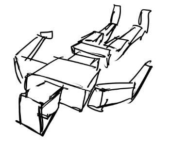
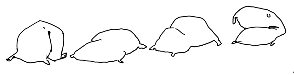
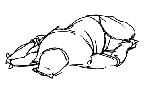
One of my many (many) drawing difficulties is the dead body lying on floor syndrome. This pushes one thing I think I’m good at (the human body) against another thing I really struggle with (perspective). Perspective isn’t hard, per se, and often my most successful perspective drawings are where I try not to get too rigid with it, but inevitably (especially as I’ve gone digital) I tend to fall in to the everything-is-a-box and can be drawn in perspective. And since the human body is extra hard to draw, that means extra boxes and extra hard perspective.
And that’s sort of useful, but it really steals a lot of fluidity away from the human form. Plus, and I dunno if this is a feature of my brain but it tends to lead to a lot of floating boxes. These notional boxes taking up head, torso, arms and legs, still sort of follow the placement of wherever I put them – rather than, as with the human body – sagging int other space that’s there.
When stuck on this problem I start looking at Geoff Darrow, who’s Hard Boiled is a bible for bodies lying on the ground.
I mean, look at that. Every body is painful reminder of the fact we’re only human flesh bags.
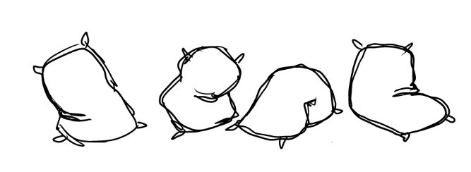
Anyway, staring at this, it seemed to me, the boxes where my problem, and if I could think of another metaphor (it’s not the right word, for what I’m trying to do – a drawing anology?) that might help it might be worth considering and staring and staring and it occurred to me if I thought of the torso as a sack of spuds, that would give me much of the flexibility of a real human body –
I feel the weight of a sack like this, much more than I do a box, and it has a bend to it that the body does that none of my box drawings ever do.
And if I extend the metaphor so instead of a box human we end with a person made of bags of spuds (or other less-norn-irish stuff) we can have a better way to think about the body in perspective, something that can keep the all of the relative lengths of the body parts the same while also making me think about weight and giving me the flexibility to move the body.
Anyway, this has JUST occured to me, so maybe it’s a bad idea, but sometimes I think you need to question your assumptions so you can rethink stuff, especially stuff you’re stuck on.