Hey, so my Pal Steve Denton drew up a page of Dredd and I thought I could help him beef up the story telling. I thought this would be of interest. (Steve’s ok about me posting this btw, but he’s on face book if you’d like to say hello)
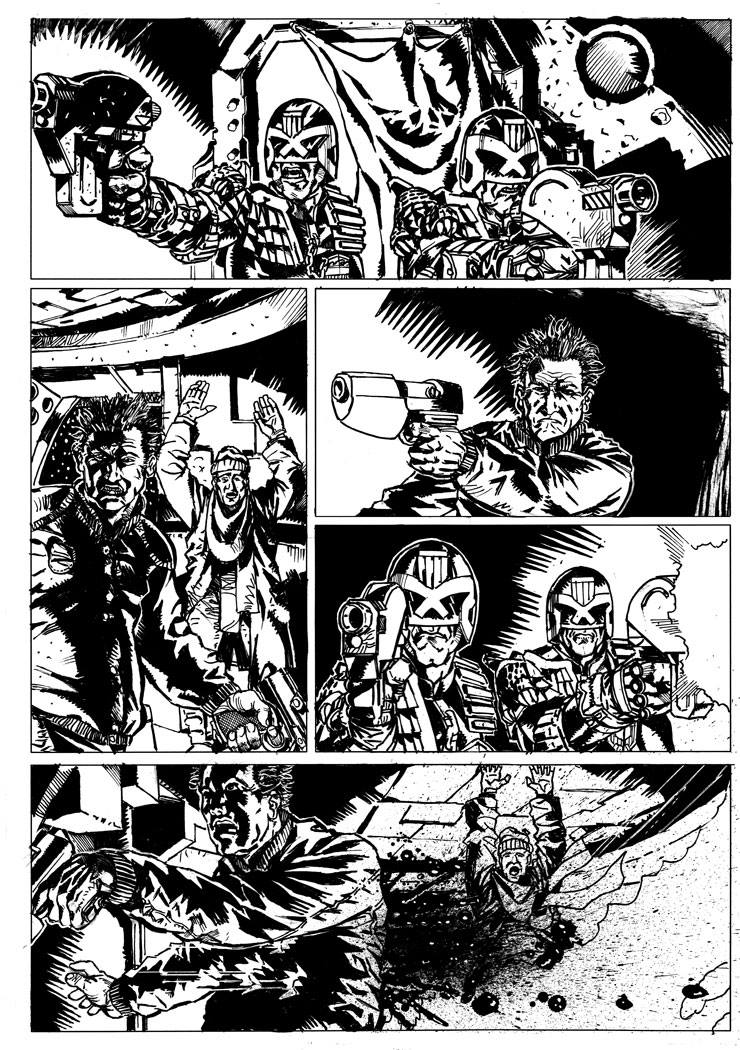
Here’s Steve’s original page:

So, on these redraws I have a couple of rules for myself: largely I don’t redraw any of the art. I try and use as much of the art as it exists – it’s not about quality of the linework it’s about how to strengthen the storytelling. I can accomplish that by selecting and resizing, and flipping and moving artwork around. Sometimes that leaves holes in the page and so I’ll scribble a bit of a redraw over that. But I’m always wary of the idea that many redraws are someone going “You should draw more like me”.
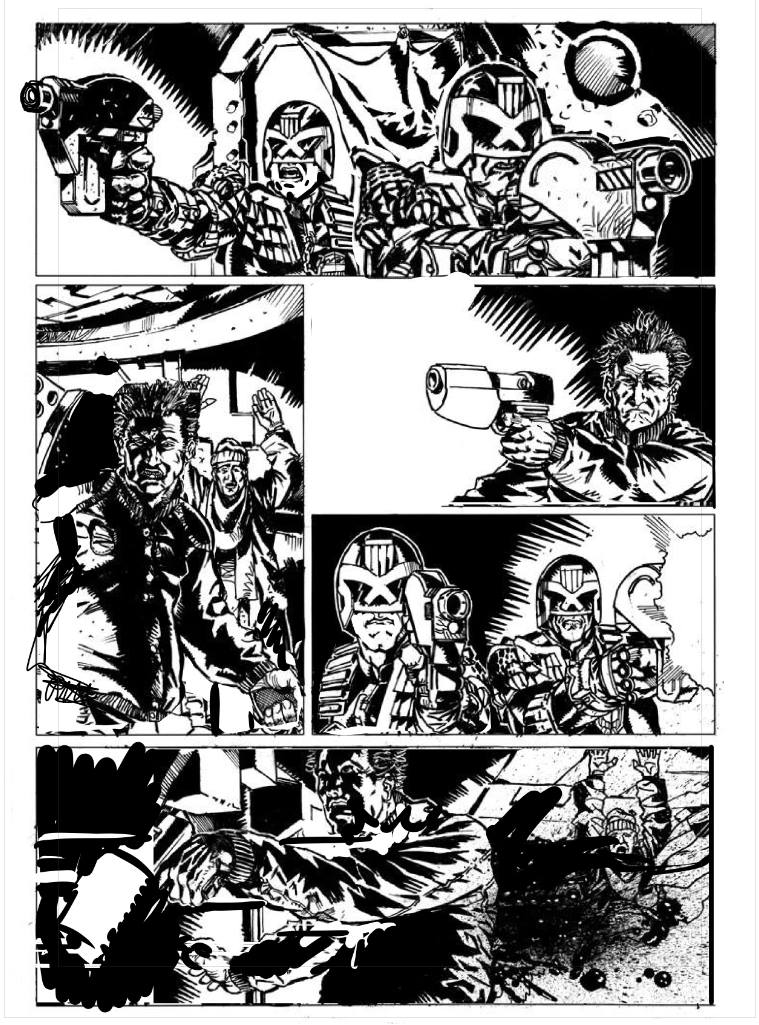
So, that said, here’s the redraw

Ok, I don’t have a script for this, so I might make incorrect assumptions about what’s going on a who characters are, but here’s the notes I gave to Steve (with some extra annotations as they occur to me in square brackets)
Steve, I hope you don’t mind, I took the liberty of tweaking your page a little bit, I think there’s a few places you could pump up the story telling and help push the depth a little better.
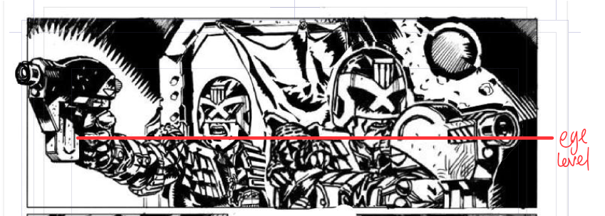
panel one – making Dredd larger than the other judge (is the other one rico? I’ve assumed he is and dea-ged him so he looks similar but younger.)[making dredd larger is basically bringing him closer to us the reader, this adds to the sense of depth going on, especially with a bit of overlap, and making sure they’re still hanging off the same horizontal line – the eyeline on this panel is roughly where dredd/rico’s chins are. So if I increased dredd to a rediculous size, as long as I lined the chins up it would still be a convincing perspective…]

Panel two, pushed the guy over a little in the panel, so you still get the distance, but the overlap pushes the 3d that little bit more. [Also, as a friend of all letterers, I try and push all characters to the right of frame where possible…]
Panel 3, I’ve moved him further over in the panel so he’s less centre of frame (in TV this is referred to as a “Noddy” shot, when you have two people face each other you want to leave plenty of deadspace in the opposite sides – since you lack – at least in this page – a decent shot of judges and bad guy in one panel, you’d need to reinforce the fact they’re in the same room. I also blew out the left hand side of the panel. That’s really just my taste though 🙂
Fourth panel,[in tv land, this would be the reverse noddy, so you want dead space on the right here] I’ve flipped Rico(?) because you have them pointing guns in two different directions at the same guy (at least based on this one page, maybe a second page will show other bad guys, in which case my bad, but as is it looks a little confused, tweaking the direction of the gun here helps focus on the fact they’re in the same room)
and, finally, Panel 5, moved the guys over to the left again (same reason as the third panel) and moved the gun shots, since Dredd is aiming/shooting at shoulder height, makes no sense for the bullets to impact at waist height.
—–
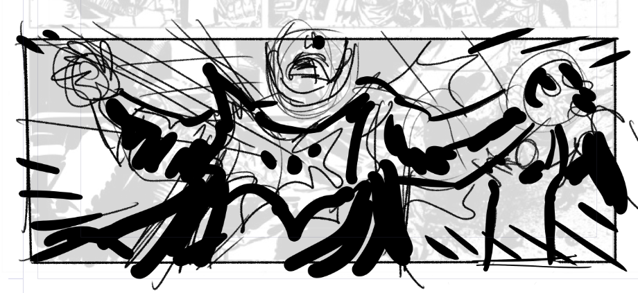
Now, I’d add, ignoring my own rules for a second, I’d be looking at ways to vary the angles a little bit – especially that last panel which feels like it needs a worm’s eye view (a shot from below looking up), or dutch angle (a tilted angle) to add a bit more impact, it’s a little TV budget shooting right now. Something a bit more like this (for example)

