S/FX

I love S/FX I think they’re vastly underused, and – certainly as an artist – I think, when possible they should be drawn on the artboard.

I draw my s/fx in Clip Studio Paint, and it’s a technique that’s really simple but produces really effective results.

Step 1:

Create a new layer (Layers->New Raster Layer), call it SFX  (you rename a layer by double clicking the name of the layer in the layers window, this turns the name into a white box that you can then type over)- this will sit on top of all other art layers (and even on top of the frame layer if you’re using one) 

Next, in the Layer Properties (make sure Window->Layer Property is ticked) turn on the Border Effect (it’s the little black circle with white outline). This sets a border around anything drawn on this layer. 

Set the Edge Colour to black (just click the edge colour, which defaults to white and select black) and increase the thickness, your mileage will vary here according to your tastes, but I like a decently thick outline.

Now, set the pen colour to white and select your favourite drawing pen…

And write your SFX on the SFX layer, and you should get something like this…

or this

or this

or … well, you get the idea…

It’s for the birds

Was listening to a radio show that touched on the fact that the short story the Alfred Hitchcock film ‘The Birds’ was based on (also called ‘The Birds’) was really rather good, as well as being set in Cornwall (where my wife is from, and we’re we’d recently been to) it was also an allegory of the Blitz.

So I sat down and read it, and it IS good.

And I then started watching the movie. Which is also good (if you can ignore some of the ropier effects) the imagery is amazing, and the while the blitz allegory is entirely gone, it’s pretty good.

(Though, frankly, Melony seems a wrong ‘un – driving 60 miles to play a prank on a bloke she just met after getting her father’s employee to dig up his home address? I mean, it could take a turn for the psycho…)

Anyway, another frustrating time with digital paint, but there it is.

dredd wip

Slightly frustrating weekend. Had intended to get two pages done, got one done. So tomorrow I’ve a dredd to finish (and it’s a week late) I’ll catch up the next week (fingers crossed) been struggling with pencils (in every sense of the word; struggling to figure out how to draw and actually struggling to see what I’m drawing – another visit to the opticians due probably) But on the flip side, been finding digital inks pretty enjoyable.

I bounce back and forth between loving/hating digital inks – in the plus column, it’s the only medium that feels like the medium is invisible – I’m drawing as though I were writing – it’s purely effortless. In the minus it doesn’t have the same visceral satisfaction as inking traditionally does.

Anyone, one page done this weekend. Rubbish. (Though technically, I did do seven pages of storyboards as well…)

Trapper Hag

Doing a thing for a thing, can’t talk about it, but doing it. Have asked someone to ink it. Can’t talk about it. 

Hopefully this thing gets used in the thing and the person I can’t talk about gets to ink it, and then I can be all aglow.

Anyway, shh! You ain’t seen this…

Storyboards

Spent today doing a last minute storyboarding job for a chum.

There are things I’m good at and things I’m bad at. Things I’m good at I like to talk about, and I like to make big pointed reference to how average I am at them, and things I’m bad at I like to shout about and make light of it – because it pains me.

One thing I think I’m actually pretty good at is storyboards.

Laying out a story, communicating required elements, and not getting bogged down in over rendering – all play to my strengths.

There’s a few things I’ve noticed myself doing that are a real hang up of comics:

1) Left to right travel is even MORE important in storyboards. Flipped the horizontal on at least three or four boarded images just to keep the left-right flow going. It’s because the story boards aren’t descrete images the way comic panels are- rather they’re a single scene playing out, and cutting to a movement right to left feels odd.

2) Scene setting even more important than comics – I like to drop backgrounds in comics (often removing panel borders and giving white), or cheat them at least, and while many many backgrounds in tv are cheated (just watch line of duty and notice how much of the BG is out of focus) you can’t just drop them altogether., you’ve gotta keep backgrounds.

3) establishing where characters are in relation to each other. Again, in comics, there’s more scope to just cut characters out of a drawing, when the focus is the other character – the page serves as a constant reminder of where everyone is, doing the same thing in a story board has the effect of making the character look like they disappeared.

4) Can’t change panel shapes. Even if you change the panel shapes. I’ll stretch and expand the frame I’m using to draw a story board IF it’s supposed to include some sort of camera movement, so in the above example, that frame is taller than the view that the viewer will see. But even if you do that, you’ve still gotta keep in mind they’re looking at a landscape view – big tall things don’t work (and I like tall panels)

Anyway, those are all the tiny nuggets I gleaned from the little amount of story boarding I’ve done.

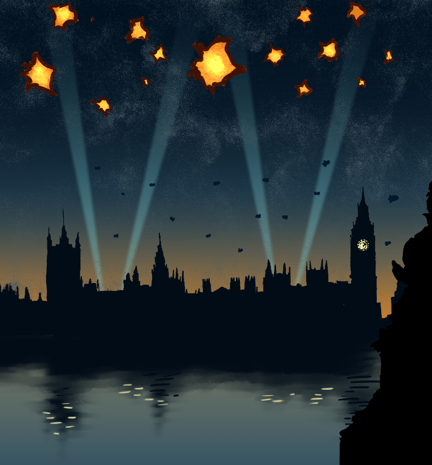
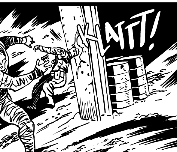
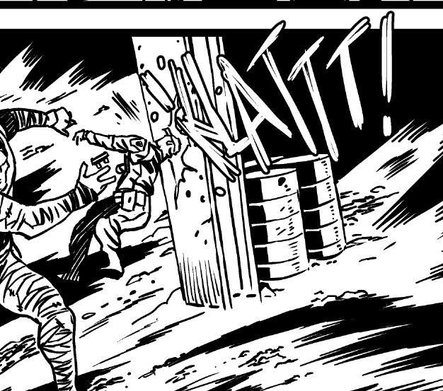
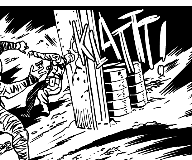
The above image btw is from the World of Tanks video game sequence, I story boarded and drew up final art that’s been animated for the game. It’s  pretty crazy!

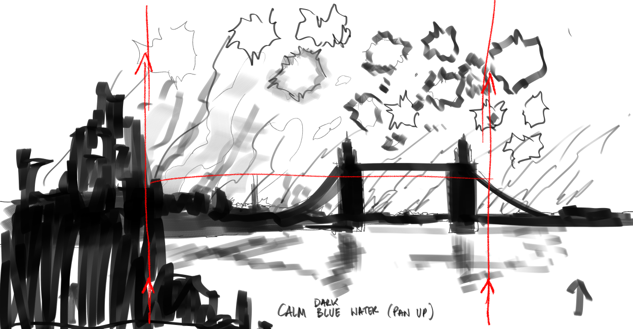
And, as if to prove, that no plan survives contact with the enemy, I ultimately dropped Tower Bridge above for Big Ben, and inked it up and it was coloured by Dee Cuniffe 

Darkseid Digital Doodle

mmm… Always frustrated that things are less realistic than I want. I don’t think I knew what I wanted from this digital paint job, but this isn’t quite it.(I like the Kirby crackle though…)

Dept of Monsterology book 2

This is one of many pages I did for Dept of Monsterology book 2. This was one of the 49 pages I drew in a month. Some of those pages were, hand on heart, some of my favourite pages I’ve ever drawn. Lookit hitlers little left foot.

You can buy a digital collection of book 2 for just £6.99 on Comixology – it’s a bargain! 

(and hey, if you’re not already a Patreon of mine, you can sign up for $1 to see early pics and some exclusive pics, and get a behind the scenes peek, with articles on Clip Studio Paint and Comics story telling for the early bird price of just $5 – only a limited number of slots at that price!)

Drawing board wip

I’m back to digital inking. Failing eyesight, and arthritis make it a better way to ink – instead of fighting with my hands and eyes and the pen and ink, I’m just battling with my ability to draw.

I never win, but I do, at least, get the odd lucky strike.

One two, Rogues here before you…

I wanted to try and paint something in Clip Studio Paint, more impressionistic than I normally do – or at least looser. The first Rogue was done with that in mind but it totally got away from me, like some small bits (I like that he looks blue without … you know… being entirely blue).

Wasn’t what I wanted though, so thought I’d have a go again this time using a photo – so I nabbed a random “male model” sketch off the interwebs, and scribbled roughly the look and painted the colorus based on the lighting in that. It’s miles better. Frustratingly so. Much less faffing in the colours, and the lighting (despite him being blue) is much more believable. I should probably do more studies of this nature.