#12 “Morrigan”
In the grand Irish epic of the Tain Bo Cuailnge, Nemain – personification of the frenzy and havoc of warfare – confuses the soldiers on the field of battle, causing them to fight and kill their own.
The Morrigan. Phantom Queen. Shape-shifting Triple Goddess. As Battle Crow she flies as a harbinger of death and defeat. As the hag she is the crafty and cunning old witch of Fairy Tale. And as Nemain she is Goddess of War, able to kill 100 men with a mere cry.
The Morrígan is one of the strangest deities in Irish Celtic mythology. Tripartite goddess of war: she is made up of three separate personalities or aspects. These three are known as Morrígu, Badb, and Nemain, but also sometimes Macha, and Anann,. There is some debate as to whether “Morrigan” is merely a title these separate Goddesses, or heroines held (like The Gorgons of Greek Mythology), or whether they were genuinely all different forms taken by The Morrigan.
The “mor” in Morrigan comes from the same route as the Old English word “maere”, meaning terror or monstrousness and which survives in modern English in the context of “nightmare”. The “rígan” translates as “queen”, giving the Godess the title of Terror Queen, Phantom Queen, Mare Queen, or simply Great Queen.
Badb (“crow”) is more often known as “Badb Catha” (meaning “Battle Crow”) and as such is associated with war and death. Her appearance would foreshadow imminent bloody battle, and on the field of war the Battle Crow would create deliberate fear and confusion among enemy soldiers. Possibly because of this, the battlefield is referred to some Celtic literature as “the garden of the Badb” (although crows do like carrion, so there may be a rather obvious dual meaning there).
Badb, Macha and Morríga were there daughters of the Farming Mother Goddess Ernmas, according to the 4th century CE text preserved in Lebor Gabála Érenn (The Book of the Taking of Ireland, more widely known as The Book of Invasions).
Macha was a Sovereignty Goddess of ancient Ireland associated with the province of Ulster, and particularly with the sites of Navan Fort (Eamhain Mhacha) and Armagh (Ard Mhacha), which are both named after her. To make things slightly more complicated however, there seem to be several different Goddesses sharing the name.
In the grand Irish epic of the Tain Bo Cuailnge, Nemain – personification of the frenzy and havoc of warfare – confuses the soldiers on the field of battle, causing them to fight and kill their own.
“Then the Neman attacked them, and that was not the most comfortable night with them, from the uproar of the giant Dubtach through his sleep. The bands were immediately startled, and the army confounded, until Medb went to check the confusion.”
Morrígan was also the Goddess of divination and prophecy who, in the guise of an elderly washerwoman, foretold the fate of the hero God Dagda when he encountered her by the river on eve of the Samhain festival.
In later medieval period, the title “Morrígan” was associated with Morgan le Fay, the sorceress Avalon, in the Arthurian legends. Morgan is said to have also appeared as a fair maiden, a hag, and in various animal forms at different times.
Folklore Thursday WIP
Adding some colour. Spend ages flatting a thing, then decide to just do it as simple blue.
Folklore Thursday 12 Layouts
Guess what it is!
Samson Sunset
This week’s folklore thursday features a bonus strip. And the reason is, well, we’re working on an advanced list of folklore topics for twitter, and they changed one without us knowing.
Being pros (which is what it says in most of my bios, so it must be true) we decided to do another (this is particular ironic given this weeks was the first I’d done well in advance) so John emailed – said he had something interesting about bees and a lion and I started thinking about what to do.
I knew it’d be a single image, I figured I’d sketch a pencil drawing of a lion lying there would do. (one of my favourite jokes Man walks into a bar with a giraffe. Man and giraffe get drunk. Man walks out, giraffe falls down drunk on ground. Barman shouts “Oi! You gonna leave that lyin’ there?” Man “that’s not a lion, that’s a giraffe”.)
Anyway, John tweets:
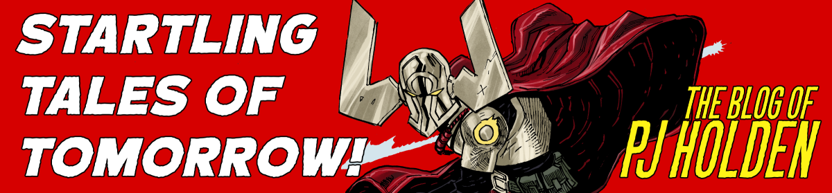
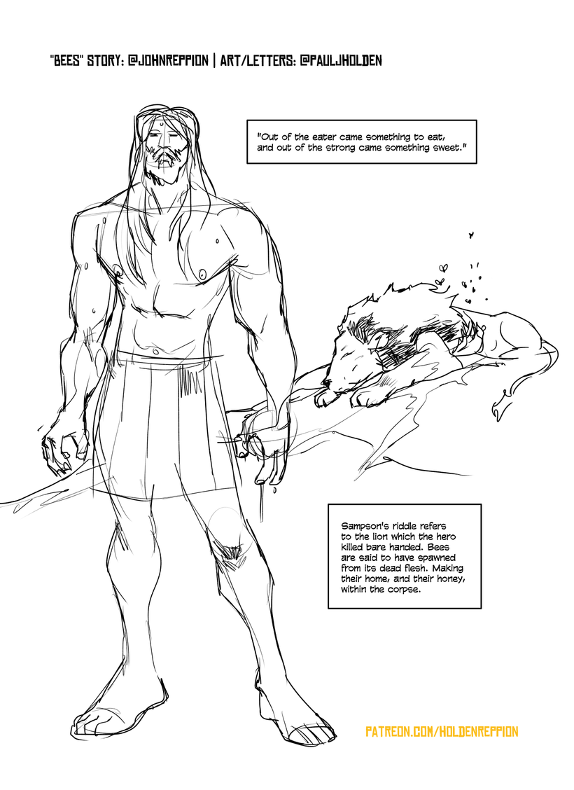
“Out of the eater came something to eat, and out of the strong came something sweet.” Sampson’s riddle refers to the lion which the hero killed bare handed. Bees are said to have spawned from its dead flesh. Making their home, and their honey, within the corpse. #FolkloreThursday
And I think “cor, Sampson!*” (Later, after doing a lot of work, I find out it’s “Samson” – you live and learn)
So now I wanted to do a big pic of Samson walking away from the Lion. But it felt too empty – and I thought, well if I ink it simple enough it’ll be quick – and could be nice to colour as a two colour animated thing. But then the background would need to be painterly.
So I googled up some images of Prince of Egypt, nabbed one to use for some colour inspiration (and er… colour picking). Coloured Samson and the lion as flat (I actually flatted them to fully colour them, but given I had a nice red/yellow background I wanted a blue foreground for the figures
I colourised the lineart in clip studio by setting the lineart alpha lock to ON, and then changing the layer from b&w to colour. Then I can draw over the black lineart with anycolour, and that’s how I did the orange colour holds below…
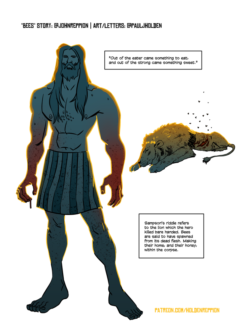
And then scumbled up a background using the various tools in clip studio, shunting colours around trying to make it work (and then, finally using the watercolour brush to add a red wash over the background, and and orange circular gradient to do a sun behind Samson.
Total time? Between 2-3 hours. Not bad. And I’m fairly happy with it. Not everything needs to be complicated.
Folklore Thursday: Bees
A BONUS!
#11 “Locker”
Davy Jones’ Locker. The deep-sea Hell of the drowned, according to pirate-lore and later nautical-lore. Davy Jones a diabolical figure, sometimes said to be glimpsed among the rigging during a storm. More often than not though, the sea-devil simply waits below.
————————————————————————-
Who was Davy Jones? The name was first recorded in print (in reference to the deep sea graveyard or Hell known as “Davy Jones’ Locker”) in Daniel Defoe’s 1726 work Four Years Voyages of Captain George Roberts. The locker. and the fiend himself. were described in more detail in Tobias Smollett’s The Adventures of Peregrine Pickle, published in 1751:
“If it was not Davy Jones himself. I know him by his saucer eyes, his three rows of teeth, his horns and tail, and the blue smoke that came out of his nostrils. What does the blackguard hell’s baby want with me?” […] This same Davy Jones, according to sailors, is the fiend that presides over all the evil spirits of the deep, and is often seen in various shapes, perching among the rigging on the eve of hurricanes:, ship-wrecks, and other disasters to which sea-faring life is exposed, warning the devoted wretch of death and woe.
It’s been hypothesised that the name Davy Jones may derive from the Welsh Patron Saint, David, whose name would often have been invoked by sailors from that country. Jones is, of course, one of the most popular Welsh surnames, so “Davy Jones” may have originated as a kind of joke. Others argue that Jones in this instance is a corruption of Jonah – the Biblical figure who was famously swallowed by a whale, or giant fish. The term “a Jonah” has long been used by seamen, meaning a someone whose presence on board brings bad luck to the ship and her crew.
David Jones was a real pirate, who flew the skull and crossed bones as he sailed upon the Indian Ocean during the 1630s. He was not very well known however (and is even less so today), so it seems unlikely that he went on to become the Devil of maritime hell.
Some say that Davy Jones was a pub landlord, who would throw drunken men into his ale locker (a lockable, strong cupboard) so that they could be press-ganged into service aboard ships. Again though, there seems little if any concrete evidence for this.
All in all Davy Jones remains something of a mystery; a piece of eighteenth century folklore whose origin is obscured by vague and conflicting sources. The fact that Jones is seen as a hoarder of treasures, cargoes, and souls, suggests to me that he is greed, and perhaps hubris personified. He is a warning to those who would dare to overload their ships, and think that they could best the mighty ocean, and defy its power.
Perhaps then Davy Jones is best thought of as a more modern incarnation of the Norse sea Goddess Rán, whose very name meant “plunder”, “theft”, or “robbery”. Rán would cast her gigantic net, dragging sailors and ships down to a watery grave upon the ocean bed.
Folklore 11 Layouts and Pencils
Folklore Thursday: Wodwose
Published: 22 August 2019
Hello!
Hey, if you’re here, then welcome, settle in and I hope you find something you like. This is mine (PJ’s) old patreon, and so there’s still some old posts. I debated deleting them all and then thought, to heck with it, that’ll take ages, so have left them up. But going forward (ugh, please forgive me for that expression) you’ll get a weekly update on the new one page folklore thursday comic John and I are doing, and maybe more posts as we either talk about the process or stick up some articles on the subjects. We’re here for the long haul, so stick with us!