Dept of Monsterology book 2

This is one of many pages I did for Dept of Monsterology book 2. This was one of the 49 pages I drew in a month. Some of those pages were, hand on heart, some of my favourite pages I’ve ever drawn. Lookit hitlers little left foot.

You can buy a digital collection of book 2 for just £6.99 on Comixology – it’s a bargain! 

(and hey, if you’re not already a Patreon of mine, you can sign up for $1 to see early pics and some exclusive pics, and get a behind the scenes peek, with articles on Clip Studio Paint and Comics story telling for the early bird price of just $5 – only a limited number of slots at that price!)

Drawing board wip

I’m back to digital inking. Failing eyesight, and arthritis make it a better way to ink – instead of fighting with my hands and eyes and the pen and ink, I’m just battling with my ability to draw.

I never win, but I do, at least, get the odd lucky strike.

One two, Rogues here before you…

I wanted to try and paint something in Clip Studio Paint, more impressionistic than I normally do – or at least looser. The first Rogue was done with that in mind but it totally got away from me, like some small bits (I like that he looks blue without … you know… being entirely blue).

Wasn’t what I wanted though, so thought I’d have a go again this time using a photo – so I nabbed a random “male model” sketch off the interwebs, and scribbled roughly the look and painted the colorus based on the lighting in that. It’s miles better. Frustratingly so. Much less faffing in the colours, and the lighting (despite him being blue) is much more believable. I should probably do more studies of this nature.

The Play’s the thing

Auditioned for a play. Got a part. Local am dram.

Bit nuts, this is lining up to be the busiest year ever for me. But then, that’s all the more reason to do something else. Something that I can switch myself off for and just be somewhere else.

I’ve acted before- 20 years ago and went back to it last year, did Macbeth and had friends I’ve known for decades come up and say “I’ve never seen you stand so still”. Then I did another play where I was a narrator and stood on stage stock still for an hour. I liked the stillness. I like the knowing that I have something to say at an exact moment. The most awkward bit of rehearsals I find are the bits before and after the rehearsing where you’re mixing, and I still find myself standing alone amongst a crowd.

It’s wanky to say it, I know, but I like just losing myself in someone else’s lines.

Look there’s me playing ross (centre) in Macbeth! What a tubby little man I have become.

(I still want to do a mega sci-fi fantasy epic of Macbeth… but it’s unlikely to ever happen…)

Girl

I’ve always struggled to draw pretty. Ugly, is more my metier. But I keep trying. Two good friends of mine have suggested, and I think they’re right, that US comics, especially ,thrive on “attractive”-attractive women and attractive men. It may be a British thing that we tend to move more towards brutish (or it may just be me). 

British artists that can do pretty do remarkable well in the States. 

British artists that can’t, end up having a decent career in the UK, but never noticed beyond those shores.

My mum (god rest her) used to say my women looked like men. I’m horribly aware of my shortcomings in this area.

Anyway, this sketch is alright though – literally a 2 minute pen & ink sketch – drawn using one of the Frenden brushes in Clip Studio. My instincts are to use a very controlled line, nothing rough, thought it’d be a fun exercise to use a rough pen to draw something nice.

Work in Progress

Digital inks, I’ve tried to give you a sense of the pencils over the inks – you can see my pencils are pretty rough.

This is from a new Dredd strip I’m working on, written by my old comics chum Michael Carroll. Hot off the drawing table, finished the pencils and inks for this today.

First day of school for one of the kids today too. Should be back to school next week, and hopefully I can catch up on stuff. Running a little late on this, and a couple of projects I wanted to get down have ended up on hold, while I look after the family (Annette, my wife, broke her arm two years ago, and had the radial arm removed last month because she’d lost rotational movement in her wrist following the breakage. She’s doing great, but recovery is taking a long time)

I’ll try and post something non-spoilery of every page I’m doing as I do them, which is fun for me, because usually only the editor sees this stuff until it sees print.

I used to do a lot of these kind of warped perspective shots, I think I lost the knack of it somewhere along the line – they’re inaccurate, but off kilter and usually have some energy – and in the wider context of the page being non-exact doesn’t matter too much.

Patreon Plans

Hi, thanks for signing up (was not expecting the guilty feels of knowing the people that sign up and happily counting them as friends).

I intend to get into a posting rhythm, on the one hand don’t want to overwhelm with posts on the other don’t want to make it feel like poor value money. 

My plans with the Patreon are to do articles on story telling and tutorials on clip studio paint and I think, Photoshop, given the funding on Patreon I can now subscribe to Adobe’s Creative Cloud (quick hint, the photography subscription is the cheapest sub at only £10 per month, but  only gives you access to Adobe Photoshop) and, obviously, sketches and what-I’m-working-on-now insider bits and pieces.

You’ll get all that in the backstage pass area, for everyone else, it’ll be art, blogposts and more general stuff. Now the school summer holiday has passed I may even get time to do some video stuff (for Patreons!)

Once a month I’ll unlock one of the backstage pass articles for general readers.

I’m not expecting Patreon – as it has in some other cases – to be a big source of income for me, but it has motivated me to blog more, and with more depth on subjects. Hopefully I can find the balance to make it something worth your time and money.

Thanks again, I genuinely appreciate it.

-pj

(Oh, and if you’re coming to this post new: There are still slots in the $5 early bird backstage pass patreon, get it while it’s hot!)

Commando Comics

Commando comics are a long running British comics institution. Begun in 1961, they started as – and remain – a way to tell thrilling war stories for boys. 

While 2000AD gets all the accolades for staying the course, and growing up with its audience, Commando is still running along side it – oft unnoticed (certainly based on conversations in twitter).

One of the problems of UK comics, is the number of silos there are. 2000AD readers often don’t go outside 2000AD. Marvel fans stick with marvel, and whoever is reading the beano isn’t reading commando.

And it sorts of stays that way for creatives too.

I’ve always loved commando comics. I grew up them and 2000AD.

Recently I’ve started to pick up a few and, while they’re usually 50% reprint, they remain pretty great.

Here’s a little blog post on the history of commando that’s pretty interesting.

But what I really wanted to talk about was the formatting of the books, and their storytelling potential.

The books themselves are digest size – around 2/3s the height of A5 and roughly the same width, which has dictated how the stories are told. I’ve always loved the format and have toyed with doing something in that format.

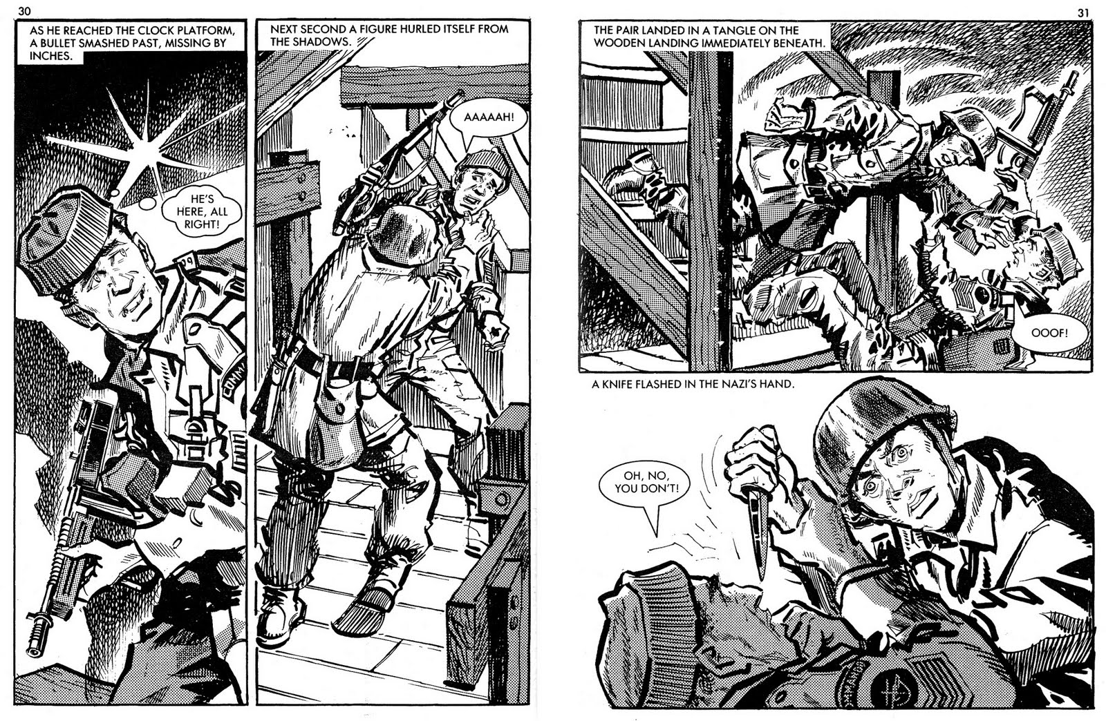
(Two pages of a commando comic, drawn by Gordon C Livingstone)

Your average Commando comic page can only really get two panels per page (here GCL has managed to split one page in to two vertical panes, and dropped the background out of the second panel on the second page which really opens up the space and lets the art breath).

Commando comics were often filled with captions, every panel had a caption (as a kid I’d often skip the captions, they felt like eating the vegetables on your dinner) and, looking over some issues, it’s pretty clear they were there as filler – making the brisk paced stories slow down. The captions would often expand something in the panel (or explain it) repeating the art, the dialogue would then reinforce that.

 Take this example (again, art by the definition of Commando Comic art the incomparable Gordon C Livingstone)

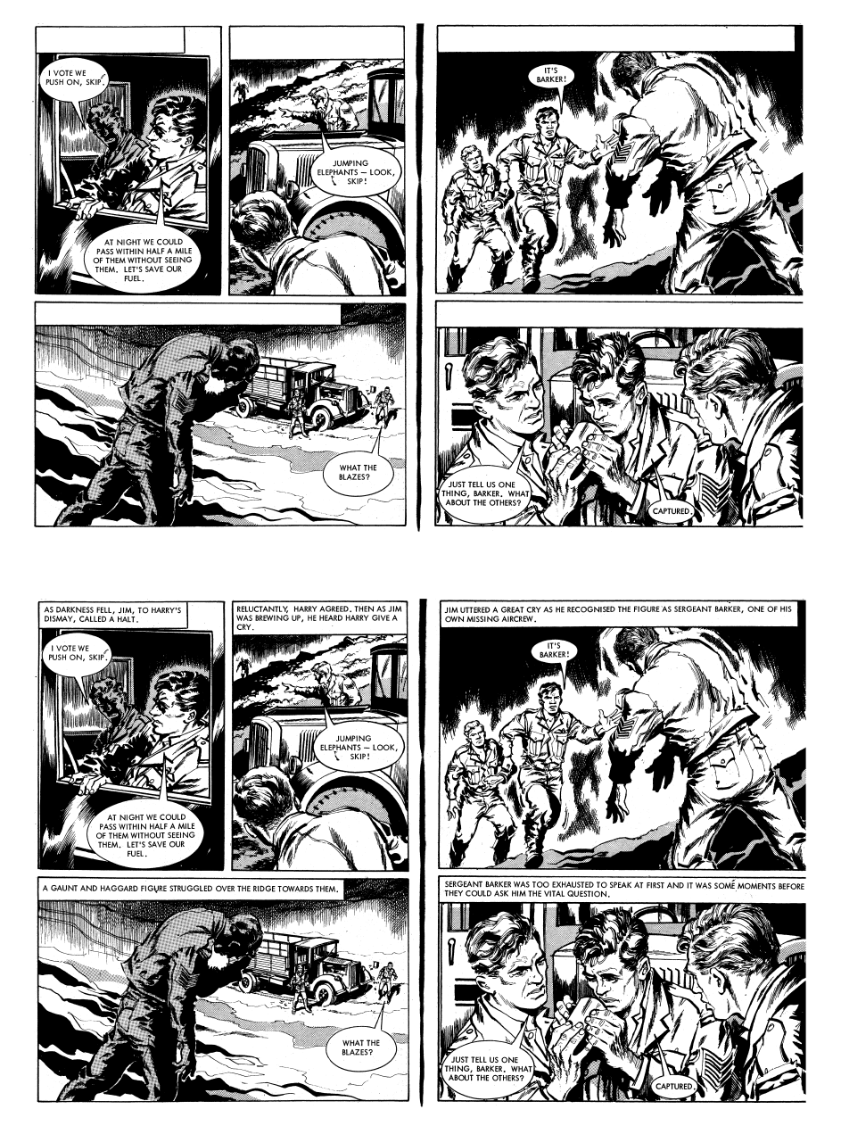
(This example from Trouble Hunter – out this week, Command no 5048(!) but reprinting a story originally from January 1969)

Captions removed (and added back in) and you can see they’re expanding the scenes a little but also pretty much redundant (actually GCL is so good the art works even dialogue free)

(My favourite caption is on the second panel of the first page here “…Then as Jim was brewing up…” – was Jim supposed to be making a cuppa in this panel? where’s the kettle? was it scripted? and GLC decided ‘Sod that’ or was it added in simply as a way to slow the narrative down a bit?)

Like the old Rupert the Bear strips (where it was a drawing above a narrative caption that contained both narration and dialogue), it’s suggesting a form of storytelling that comics don’t really do now – closer to the fusion of text and pictures maybe than most comics lean towards. 

I’m as guilty as anyone of pushing the importance of storytelling in art and making sure you can read the story without text, but it’s interesting to see what you can do when you lean in a slightly different direction.

Commando comics, really the digest comic size (because, once upon a time, Commando comics were a late entry into the digest comic scene) are 63 pages long, and begin and end with a splash page – this symmetry gives them a neat little formula from which to work with. Every story is self contained to. The length makes it feel like you’re reading a short novel.

As an artist, it’s interesting to see the variety of techniques on display in b&w. As a story teller I love formula – I think there’s a lot you can do with very specific limits imposed.